1 #components Components

Design components are reusable designs that can be applied using just the CSS class names specified in the component. These components require the cosmic theme to use.

1.1 #components.button-photo Button Photos

Button photos are photos with a caption overlay that link to some content. These can be used for large button styles in a grid as photo navigation.

Examples
Default styling

Photo with a captioned overlayed on it that links to content.

A captioned photo button.
Here is the photo caption
.button-photo--noshade
A caption in the middle with no shade for dichromatic images.

Photo with a captioned overlayed on it that links to content.

A captioned photo button.
Here is the photo caption
.button-photo--shade
A caption in the middle with a shade over the caption.

Photo with a captioned overlayed on it that links to content.

A captioned photo button.
Here is the photo caption

1.2 #components.cta-button Call To Action Button

A button with a box around it for emphasized links and calls to action.

Examples
Default styling
.cta-button--submit
A consistently green button, should used exclusively for submit buttons and primary site calls to action (e.g. apply)
.cta-button--delete
A consistently red button, should be used exclusively for destructive actions (e.g. delete account/data)

1.3 #components.envelopes Envelope

An envelope is a full-bleed rectangular content block.

Examples
Default styling

Envelope Title

Here is some content inside this envelope.

.envelope--standard
An envelope with standard top/bottom padding.

Envelope Title

Here is some content inside this envelope.

.envelope--narrow
An envelope with a small amount of top/bottom padding.

Envelope Title

Here is some content inside this envelope.

.envelope--flush
An envelope with no top/bottom padding.

Envelope Title

Here is some content inside this envelope.

.envelope--parallax
An envelope with a parallax background.

Envelope Title

Here is some content inside this envelope.

.envelope--style-black
An envelope with black background and white text.

Envelope Title

Here is some content inside this envelope.

1.3.1 #components.envelopes.feature Feature Envelope

A feature envelope is a full-bleed rectangular content block with a flush photo on one side. Feature envelopes are used for spotlight peices often highlighting a person or a topic that features prominent photography.

Examples
Default styling
Feature Envelope Title
Feature Envelope Text
Call to Action
.envelope-feature--text-left
A feature envelope with a photo on the right and text on the left.
Feature Envelope Title
Feature Envelope Text
Call to Action
.envelope-feature--text-right
A feature envelope with a photo on the left and text on the right.
Feature Envelope Title
Feature Envelope Text
Call to Action

1.3.2 #components.envelopes.hero Hero Envelope

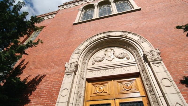
A hero envelope is a large content spotlight in envelope format, replacing the old "feature" component. Hero envelopes are often used for top of the page spotlights for the most prominent new stories or marketing messages. Most pages will only use a single Hero, often in the topmost spot. Any text location (left/right) can be combined with any variant (base, shade, box).
Examples
Default styling
Hero Envelope Title
Hero Envelope Body.
Call to Action
.envelope-hero--text-left
A hero envelope with text on the left.
Hero Envelope Title
Hero Envelope Body.
Call to Action
.envelope-hero--text-right
A hero envelope with text on the right.
Hero Envelope Title
Hero Envelope Body.
Call to Action
.envelope-hero--text-top
A hero envelope with text at the top.
Hero Envelope Title
Hero Envelope Body.
Call to Action
.envelope-hero--text-bottom
A hero envelope with text at the bottom.
Hero Envelope Title
Hero Envelope Body.
Call to Action
.envelope-hero--shade
A hero envelope with shaded background instead of gradient.
Hero Envelope Title
Hero Envelope Body.
Call to Action
.envelope-hero--box
A hero envelope with a small shaded box around the text.
Hero Envelope Title
Hero Envelope Body.
Call to Action

1.3.3 #components.envelopes.stats Statistics Envelope

A Statistics envelope is a prebuilt envelope featuring a grid of statistics.

Example

Statistics Envelope Title

This is sample body text. Our students are smart, creative, and increasingly diverse. We support and celebrate their successes, and we work hard to provide inspiring educational opportunities in the classroom and beyond. Our enrollment is intentionally set about 25,000 because that's the sweet spot for a residential campus like ours.

100%
This is subtext.
125%
This is subtext.
125%
This is subtext.

1.3.4 #components.envelopes.stories Stories Envelope

A stories envelope contains two story blocks used to replace the use case for slideshows. These are often displayed under a hero envelope.

Examples
Default styling
Hero Envelope Title
Hero Envelope Body.
Call to Action
Hero Envelope Title
Hero Envelope Body.
Call to Action
.envelope-stories--no-flush
A variant where there is a small margin between the stories.
Hero Envelope Title
Hero Envelope Body.
Call to Action
Hero Envelope Title
Hero Envelope Body.
Call to Action
.envelope-stories--no-green
A variant where the left story does not have the green overlay.
Hero Envelope Title
Hero Envelope Body.
Call to Action
Hero Envelope Title
Hero Envelope Body.
Call to Action

1.3.5 #components.envelopes.summary Summary Envelope

A summary envelope is a full-bleed rectangular content block with larger prominent text that is used to establish the overall page messaging.

Example

This is a summary of this envelope page.

1.4 #components.feature Content Cards

Content cards are self contained chunks of content. Cards can support many different elements such as titles, subheads, teasers, images. Examples of this can be seen on the homepage of Around the O: http://around.uoregon.edu/

Examples
Default styling

A card with a photo, title, and subhead used for a story listing for a news article.

A story listing card.
February 15

Bio student first at UO to win Gates Cambridge Scholarship

.card--large
A wider display of the card, usually used on full page listings.

A card with a photo, title, and subhead used for a story listing for a news article.

A story listing card.
February 15

Bio student first at UO to win Gates Cambridge Scholarship

.card--borders
A card with borders (has newer specs and hence displays differently.

A card with a photo, title, and subhead used for a story listing for a news article.

A story listing card.
February 15

Bio student first at UO to win Gates Cambridge Scholarship

1.5 #components.grid Grids

A responsive grid system for website content defined entirely by classes. These grids will be up to the defined number of columns wide, but will reduce to less columns in smaller spaces to fit the content comfortably. These Grids will automatically fill all available space with the grid-item subelements.

Examples
Default styling
First Grid Item
Second Grid Item
Third Grid Item
Fourth Grid Item
Fifth Grid Item
.grid--2col
A 2 column Grid
First Grid Item
Second Grid Item
Third Grid Item
Fourth Grid Item
Fifth Grid Item
.grid--3col
A 3 column Grid
First Grid Item
Second Grid Item
Third Grid Item
Fourth Grid Item
Fifth Grid Item
.grid--4col
A 4 column Grid
First Grid Item
Second Grid Item
Third Grid Item
Fourth Grid Item
Fifth Grid Item
.grid--5col
A 5 column Grid
First Grid Item
Second Grid Item
Third Grid Item
Fourth Grid Item
Fifth Grid Item
.grid--2col-40-60
A 2 column grid split 40%/60%
First Grid Item
Second Grid Item
Third Grid Item
Fourth Grid Item
Fifth Grid Item
.grid--2col-60-40
A 2 column grid split 60%/40%
First Grid Item
Second Grid Item
Third Grid Item
Fourth Grid Item
Fifth Grid Item
.grid--flush
A grid where all grid-items are flush with each other
First Grid Item
Second Grid Item
Third Grid Item
Fourth Grid Item
Fifth Grid Item
.grid--strict
A grid that will never allow larger items on incomplete rows
First Grid Item
Second Grid Item
Third Grid Item
Fourth Grid Item
Fifth Grid Item
.grid--even
A grid that only breaks to even pairs (4-2)
First Grid Item
Second Grid Item
Third Grid Item
Fourth Grid Item
Fifth Grid Item

1.6 #components.hide Hide Toggles

Hide toggles are used to hide elements under certain situations (mobile phones, etc.).

Examples
Default styling
This text will only display under certain circumstances.
.hide--mobile
Objects hidden on mobile.
This text will only display under certain circumstances.
.hide--tablet
Objects hidden on tablets.
This text will only display under certain circumstances.
.hide--desktop
Objects hidden on desktop.
This text will only display under certain circumstances.

1.7 #components.listing Listings

A listing is a list of items with a photo and text, such as a list of articles or profiles.

Examples
Default styling
This is the listing title.
This is the listing subhead.
This is the listing teaser.
.listing--photo-left
A listing with the photo on the left
This is the listing title.
This is the listing subhead.
This is the listing teaser.
.listing--photo-right
A listing with the photo on the right
This is the listing title.
This is the listing subhead.
This is the listing teaser.

1.8 #components.longform Longform Components

Longform components are used to add a unique visual style to longform stories.

Examples
Default styling
Longform Author
Longform Title
This is the longform summary paragraph.
.longform-heading--background
A black background variant of the longform heading.
Longform Author
Longform Title
This is the longform summary paragraph.

1.8.2 #components.longform.layout Longform Layouts

Longform layouts allow an editor to provide different content widths for the unique content in a chunk of a longform story.

Examples
Default styling
Longform Author
Longform Title
This is the longform summary paragraph.
.longform-layout--content
A section that ends at the usual content boundary.
Longform Author
Longform Title
This is the longform summary paragraph.
.longform-layout--wide
A section that expands a bit past the usual content boundary.
Longform Author
Longform Title
This is the longform summary paragraph.
.longform-layout--fullbleed
A section that bleeds to the edge of the page.
Longform Author
Longform Title
This is the longform summary paragraph.

1.8.3 #components.longform.pullquote Longform Pullquote

Longform pullquotes provide visual emphasis on a quote in a longform story.

Examples
Default styling

This is a pullquote for longform story content.

.longform-pullquote--left
Left floated pullquote.

This is a pullquote for longform story content.

.longform-pullquote--right
Right floated pullquote.

This is a pullquote for longform story content.

1.9.1 #components.navigation.pager Pager

Paged navigation is a list of page numbers when more than 1 page of content is available.

1.9.2 #components.navigation.pager-alphabetical Pager

Alphabetical pager is a list A-Z links for paging of content indexed alphabetically

Example
pager-alphabetical.hbs NOT FOUND!

1.10 #components.section-header Section Headers

Section headers are linkable bars at the top of a section of content which describes the content and provides a link to more of that type of content. Use the palette modifier classes to change the section header color.

1.11.1 #components.sprites.socialicon Social Media Icons

Social media icons can be used for button links to social media accounts.

Example

1.12 #components.table Responsive Tables

Responsive tables provide augments to standard HTML tables which adjust their display for better usability on mobile screens.

Examples
Default styling
Header 1 Header 2 Header 3 Header 4 Header 5 Header 6
Cell 1 Cell 2 Cell 3 Cell 4 Cell 5 Cell 6
.table--responsive
A responsive table for presentational data.
Header 1 Header 2 Header 3 Header 4 Header 5 Header 6
Cell 1 Cell 2 Cell 3 Cell 4 Cell 5 Cell 6
.table--data
A responsive table for data-heavy (spreadsheet style) data.
Header 1 Header 2 Header 3 Header 4 Header 5 Header 6
Cell 1 Cell 2 Cell 3 Cell 4 Cell 5 Cell 6

1.13 #components.timeline Timeline

A timeline is a vertical arrangement of items that represent dates and deadlines.

Examples
Default styling

Four available styles:

  • White (timeline__card--white)
  • Blue (timeline__card--blue)
  • Orange (timeline__card--orange)
  • Green (timeline__card--green)

Cards are dynamically positioned to the left and right of the timeline.

  • Aug 1, 2017

    Card Title

    This is an example of a white timeline card. It features a date, title, and teaser text.

  • Aug 1, 2017

    Card Title

    This is an example of a white timeline card. It features a date, title, and teaser text.

.timeline--modifier
A different color variant.

Four available styles:

  • White (timeline__card--white)
  • Blue (timeline__card--blue)
  • Orange (timeline__card--orange)
  • Green (timeline__card--green)

Cards are dynamically positioned to the left and right of the timeline.

  • Aug 1, 2017

    Card Title

    This is an example of a white timeline card. It features a date, title, and teaser text.

  • Aug 1, 2017

    Card Title

    This is an example of a white timeline card. It features a date, title, and teaser text.

1.14 #components.videos Videos

Video wrappers provide css code to make video embeds resize responsively. Inspired by https://www.smashingmagazine.com/2014/02/making-embedded-content-work-in-responsive-design/

Example