

A Fresh Look Forward
You may have noticed Oregon looks—and sounds—a little different. So, why the change, and why now?
Strong brands evolve. When a brand no longer fully reflects who we are or helps advance our mission, it’s time to take a closer look. Our audiences have changed. Our national reach has expanded. And with growing momentum across the university, more eyes are on Oregon than ever before. So we asked: Is our brand keeping pace? After extensive research, hundreds of conversations, and market testing, one thing became clear—Oregon was ready for a refresh—one that more distinctly expresses who we are, what sets us apart, and where we’re headed.
Welcome to the next chapter of the University of Oregon brand.
Still the UO
At our core, we’re still the University of Oregon. We educate, discover, create, compete, and turn ideas into impact. What’s changed is how we express it. Our refreshed brand brings greater focus to what makes Oregon distinctly Oregon: the way we think differently, move with purpose, challenge convention, and put ideas into action.

How We Stand Out
Oregon has never been about blending in. Our visual identity shouldn’t either. The refreshed brand builds on what makes us unmistakably Oregon, with evolved colors, graphic elements, and a visual language designed to move differently.

A New Voice
If our brand were a person, it would be an unconventionalist at heart—curious enough to explore, courageous enough to create, and agile enough to create new paths when challenges appear. Our voice reflects that spirit. It’s confident and connected, driven by possibility, and always ready to turn ideas into action.
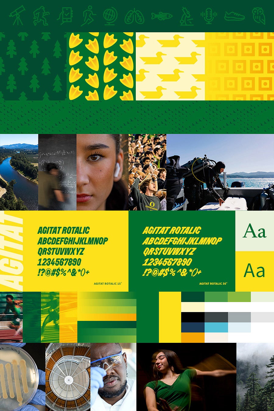
Anatomy of a Refresh
1. Messaging
Messaging ensures no matter how someone encounters Oregon, they experience a consistent and recognizable expression of our brand—a place where unconventional thinkers are cultivated and ideas are transformed into action.
2. Momentum
Oregon is a brand built on momentum. Our new graphic elements reflect that energy—adding movement, clarity, and a sense of place while creating a cohesive visual system across every touchpoint.
3. Typography
Our words carry weight. Our typography carries Oregon’s story. Used thoughtfully, typography can be bold and dynamic, or elevated and elegant. Our custom Agitat font draws inspiration from one of our most recognizable landmarks that embodies forward momentum—Hayward Field.
4. Color
Color is one of the most powerful and recognizable ways we express our brand identity. Rooted in nature and drawn from our environment, our colors help tell the story of who we are.
5. Photography
Our photography captures the energy of a community that’s always moving forward, steeped in curiosity, and not afraid to do things differently. Rooted in authenticity and a strong sense of place, we don't just tell our story, we show how our vibrant spirit takes shape—exploring, creating, and showing up for one another.

True to Our Roots
Some things don’t need to change. The Oregon “O” is one of them. Rooted in our history and recognized around the world, it carries decades of meaning, recognition, and pride. More than a logo, the “O” represents the pursuit of excellence—in learning, discovery, innovation, and competition. As our brand evolves around it, the “O” remains unmistakably Oregon.
Good Things Take Time
Minds move mountains, but change doesn’t happen overnight. While our refreshed brand has officially launched, you won’t see it everywhere all at once—and that’s expected.
Across campus, schools, colleges, and units are actively making the transition. Existing materials, budgets, production schedules, and other considerations all play a role in timing their updates, but with the intention that everyone fully transitions to the refreshed brand by summer 2027.
In the meantime, we keep moving forward. With each update, the refreshed Oregon brand becomes more visible, more consistent, and more distinctly us.
Get Started
Check out the UO’s Brand Platform and discover how you can apply the refreshed brand to your work.