
Our words carry weight. Our typography carries Oregon’s story. When used thoughtfully, typography can be bold and dynamic, or elevated and elegant.
We use three typefaces throughout our brand, each with its own intended use.
UO fonts are for UO work. University-provided fonts and related font assets are proprietary to the University of Oregon and may only be used for UO projects and communications. Do not modify, share, distribute, or use these font assets for personal projects, outside organizations, or other non-UO purposes.
Note: Former brand fonts, United and Bauer Bodoni, will remain available to communications professionals on UO-managed devices through February 1, 2027. After February 1, the fonts will be removed through an update by Information Services. Units that need additional time to revise existing materials may purchase their own font licenses and continue using United and Bauer Bodoni through June 30, 2027, at which point all new and updated communications should use the university’s new brand fonts.
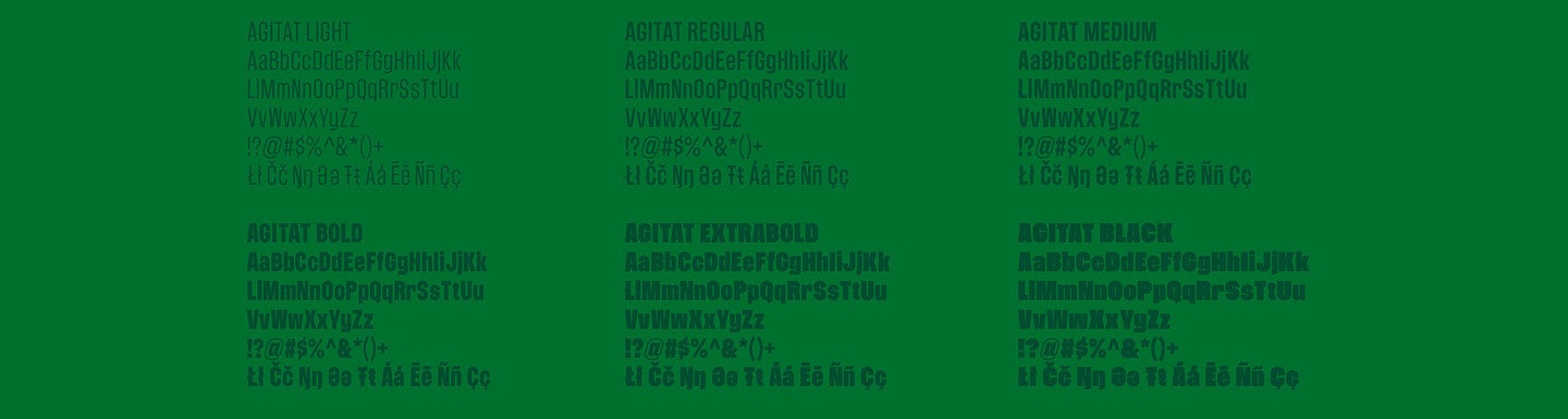
Headline Typeface: Agitat
Agitat is our headline typeface, designed to complement our primary logo and embody forward movement. This is a custom-designed sans-serif typeface unique to the University of Oregon and available through the Brand Library.
Agitat is the Latin word for “move,” which is found in the university’s motto Mens Agitat Molem (Mind Moves Mass). Pronounced Ah-Gi-Taht, with a hard “g”—it draws inspiration from one of our most recognizable landmarks that embodies forward momentum: Hayward Field. Agitat’s unconventional letterforms emphasize motion through rotalics (rotated italics). Rotalics allow our rounded characters to maintain a track-like shape and are provided in two “speeds”—15° and 30°—drawing inspiration from Hayward’s iconic architecture of the wood ribs.
Agitat is available in six weights: Light, Regular, Medium, Bold, Extra Bold, and Black. To maintain consistency in letterforms and application, rotalics are available in all-caps in a single weight: Bold.
Use Agitat for headlines, using rotalics to emphasize forward momentum when necessary. Use the bold weight most often.
In cases where Agitat may not be available—shared PowerPoint presentations, shared documents, external web platforms—use Source Sans Pro as a substitute.
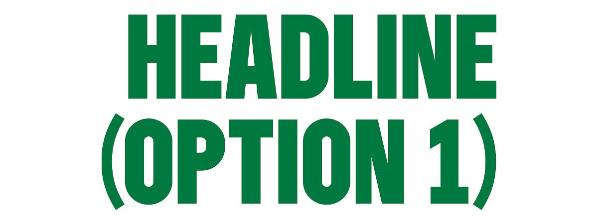
Kerning: Metrics | Tracking: 0
Size: 54 pt | Leading: 54 pt
Paragraph Spacing: 0.125
Capitalization: All Caps
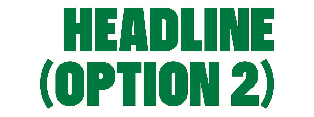
Kerning: Metrics | Tracking: 0
Size: 54 pt | Leading: 54 pt
Paragraph Spacing: 0.125
Capitalization: All Caps
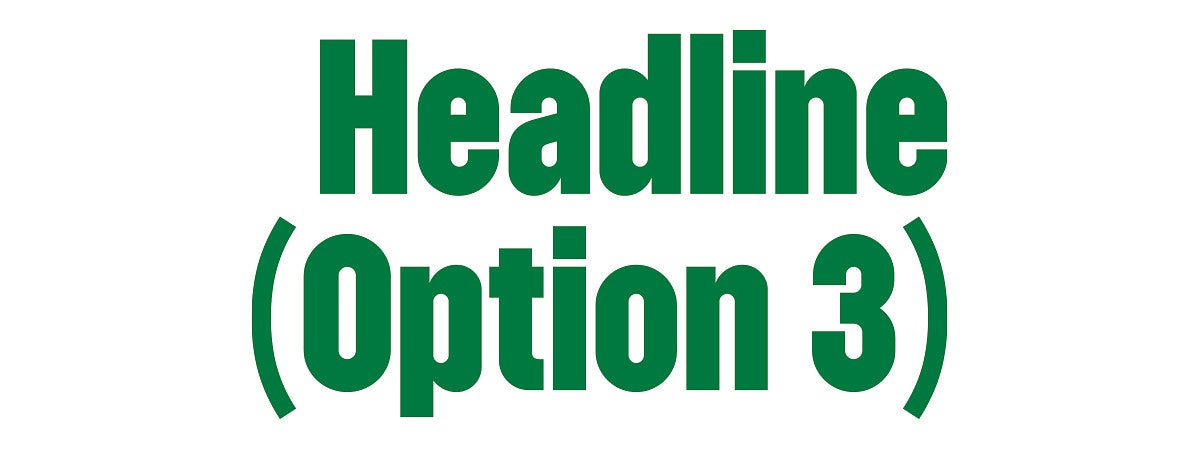
Kerning: Metrics | Tracking: 0
Size: 54 pt | Leading: 55 pt
Paragraph Spacing: 0.125
Capitalization: Initial Caps
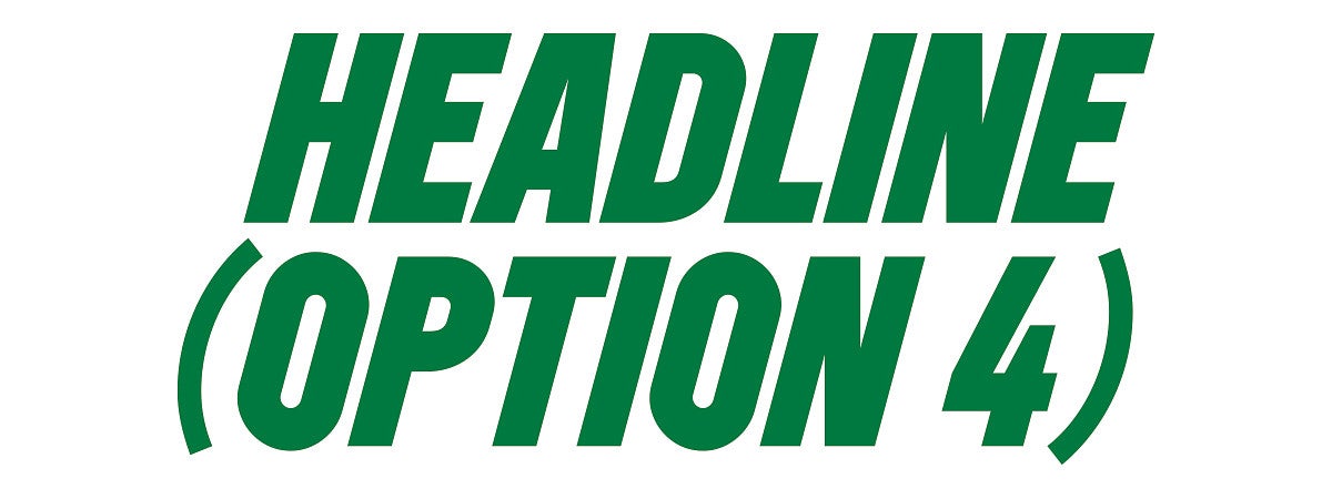
Kerning: Metrics | Tracking: 0
Size: 54 pt | Leading: 51 pt
Paragraph Spacing: 0.125
Capitalization: All Caps
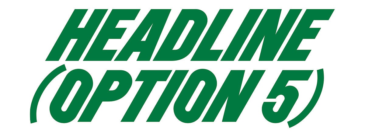
Kerning: Metrics | Tracking: 0
Size: 54 pt | Leading: 51 pt
Paragraph Spacing: 0.125
Capitalization: All Caps
Accent Typeface: Newsreader
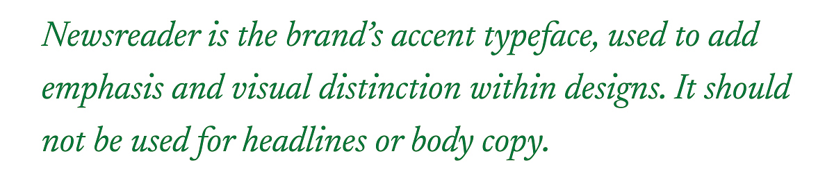
Our accent typeface, Newsreader, visually connects to academia and complements the serifs found in our primary logo. Its blend of angled and curved details pairs well with contrasting shapes found in campus architecture and throughout our visual identity.
Use Newsreader sparingly to balance the clean geometry of Agitat—primarily in introductory text, pull quotes, or short feature copy. Italics are recommended to convey forward momentum or emphasis when necessary.
Newsreader is an open-source typeface available through Google Fonts.
Sample Newsreader Text
Body Copy Typeface: Source Sans
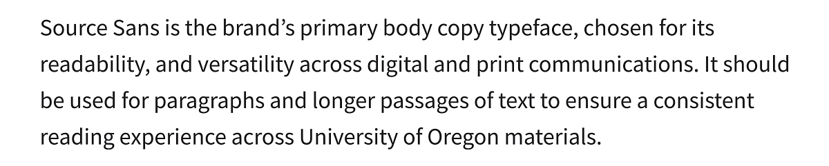
Source Sans is our body copy typeface. Source Sans is a clean, highly legible sans serif suited for longer passages and smaller text sizes.
Source Sans is an open-source font available through Adobe Fonts.
For web, use Source Sans 3, available through Google Fonts.
Sample Source Sans Text
Using Type in Print
To create typographic consistency across the brand, refer to the type styles and applications below. Type styles are available for use in the Expanded Brand Library.
Note: The examples below are for print only, not website content.
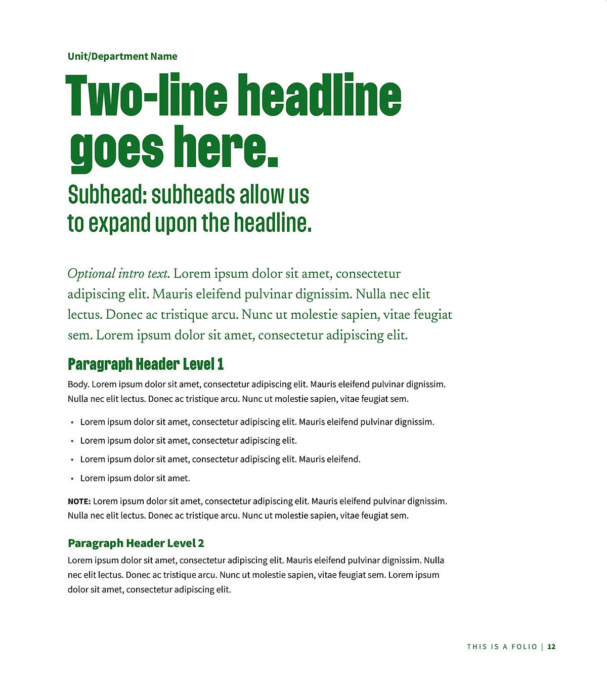
The image above shows paragraph styles in use in a one-page document designed for print, featuring multiple levels of typographic hierarchy, listed sequentially from the top of the page as follows:
- Unit/Department Name Source Sans Pro Bold, 11.5 pt font size, 15.5 leading, and tracking set at -10.
- Headline (Option 3) Agitat Bold, 54 pt font size, 55 pt leading, and tracking set at 0.
- Subhead Agitat Regular, 25 pt font size, 30 pt leading, and tracking set at 10.
- Intro Text Newsreader Italic and Regular, 15 pt font size, 22 pt leading, and tracking set at 0.
- Paragraph Header Level 1 Agitat Bold, 16 pt font size, 19 pt leading, and tracking set at 10.
- Body Copy Source Sans Pro Regular, 10 pt font size, 15.5 pt leading, and tracking set at 0.
- Paragraph Header Level 2 Source Sans Black, 13 pt font size, 17 pt leading, and tracking set at -20.
- Minimum Body Copy Size Source Sans Pro Regular, 7.5 pt font size, 10 pt leading, and tracking set at 0.
URLs
A consistent style for URLs helps our audiences recognize a call to action and find more information online.
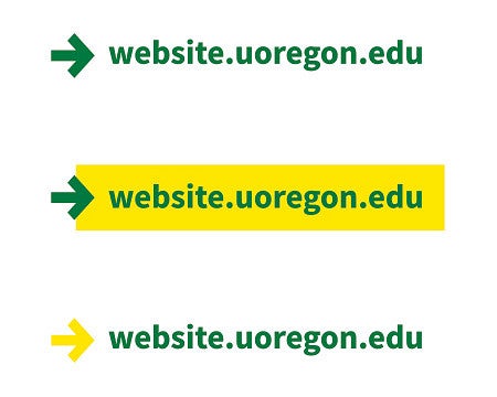
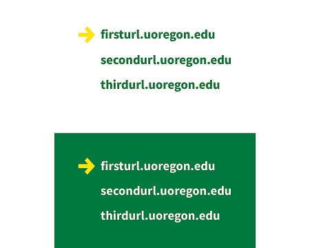
- Small URL Source Sans Pro Bold, 9.5 pt font size, 14 pt leading, tracking set at 0.
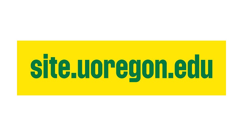
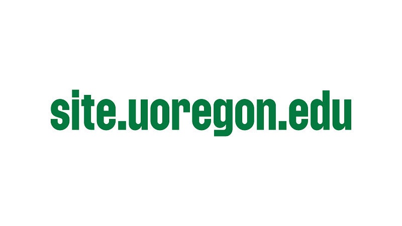
- Large URL Agitat Medium, 30 pt font size, 35 pt leading, tracking set at 0.
Remember these guidelines:
- URLs set in these styles should link to websites within the uoregon.edu domain.
- Colors used in URL styles must be chosen from our brand palette.
- Do not apply these styles on UO websites. Visit the Digital Strategy website for web template styles.
Small URL Styles—Single URL
Small URL Styles—Multiple URLs
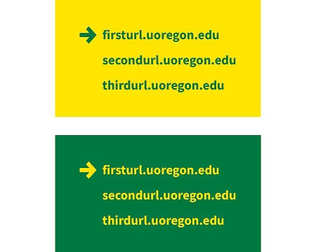
Large URL Styles

Statistics
Highlighting statistics, rankings, and other numbers in a bold, fast-moving style reinforces value, forward momentum, and impact.



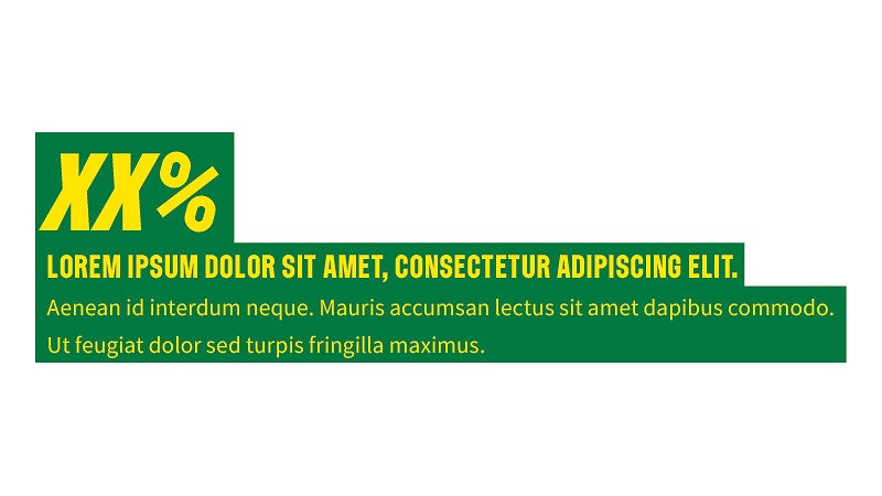
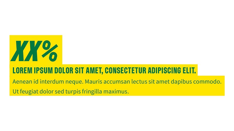
- Stat Number Agitat Rotalic 15°, 37 pt font size, 27 pt leading, and tracking set at 0.
- Stat Info Agitat Light, 11 pt font size, 15 pt leading, and tracking set at 50.
- Stat Info Emphasis Agitat Medium, 11 pt font size, 15 pt leading, and tracking set at 30.
- Additional Stat Copy Source Sans Pro, 9 pt font size, 14 pt leading, tracking set at 0.
- Scale stats larger or smaller as needed.
- Visit the Digital Strategy website for instructions on using "big numbers" on UO websites.
Type Applied
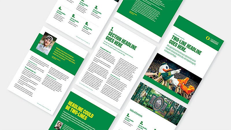
Use type in dynamic ways, even as a decorative element. We are bold and forward-thinking; our type is too.
Type on the Web
University Communications Digital Strategy team will deploy a patch for websites using Cosmic theme in late fall 2026. After that, type on the web follows the same guidance as print—Agitat for headers, Newsreader as an accent, with Source Sans for body copy. Type styles have been adjusted to maximize accessibility for web applications. Use the University of Oregon web templates as your guide for web typography.
For more information, visit our Digital Strategy site.