Primary Logo
The University of Oregon primary logo is the cornerstone of our identity system and the most immediately recognizable signifier of the Oregon brand. The university maintains a policy for the purpose of establishing guidelines and regulations for the use of the University Seal, the Oregon Duck, and the logo, and other related marks. Please review the policy prior to the use of these marks. The UO Marketing and Brand Strategy team aims to maintain consistent enforcement with professional use of our trademarks to promote and protect the university image and reputation.
Primary Logo: Horizontal
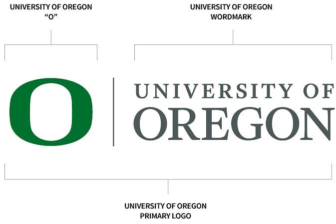
The primary logo consists of three elements: the Oregon “O”, the rule, and the university wordmark. Changing the primary logo or making variations is prohibited. The primary logo should be used in horizontal orientation whenever possible.
Primary Logo: Vertical
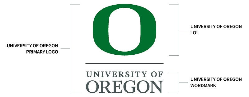
In cases where the horizontal logo doesn’t fit with design or space considerations, the stacked logo is permissible. As with the horizontal logo, there are requirements for color, size, and clear space.
Clear Space and Minimum Size
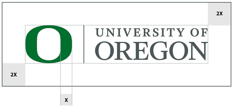
Maintain size and space standards when using the UO logo to ensure our most important identifier is prominent, legible, and impactful. The space around the logo is based on the width of the thickest part of the “O.” Minimum clear space should be 2x this width on all sides.
For large-format print applications where the logo will be seen from a distance—banners, billboards, large digital displays, or environmental installations—the “O” may use clear space that is 1x the widest part of the “O.” This allows for better legibility.
In print, the “O” should be no less than 3/8" (.375") high in horizontal or stacked versions. Logos should be sized proportionally to meet this standard.
There is no maximum size limit, but use discretion when enlarging the logo (e.g., the “O” with the wordmark). It should never dominate the composition but should be clear and distinctive as our identifying mark.
Note: Exceptions to the minimum size rule may apply for extremely small applications such as pens or small-space ads. Contact uobrand@uoregon.edu
Logo Color
Use our two-color logos most frequently. The primary logo is the combination of the UO Green “O” with Dark Gray wordmark. It is used on white or lighter-color backgrounds. When placing the logo on UO Green or dark-colored background, default to using the logo with the UO Yellow “O” with White wordmark.
Other permissible colors are shown below.
- Use the one-color UO Green logo when placing the logo over UO Yellow or when one-color print restrictions apply and the primary logo cannot be used.
- Use the UO Yellow logo when one-color print restrictions or contrast issues apply.
- Use the black or white logo options when the logo needs to be placed near or on an off-brand color—such as sponsorships or cultural organizations with color exemptions—and for increased contrast over photography, or for black-and-white prints.
Note: Logos rendered entirely in medium gray (PMS 429) are considered outdated. While some logo packages in the Brand Library may still include these versions, they should not be used.

Logo Usage
Incorrect Usage
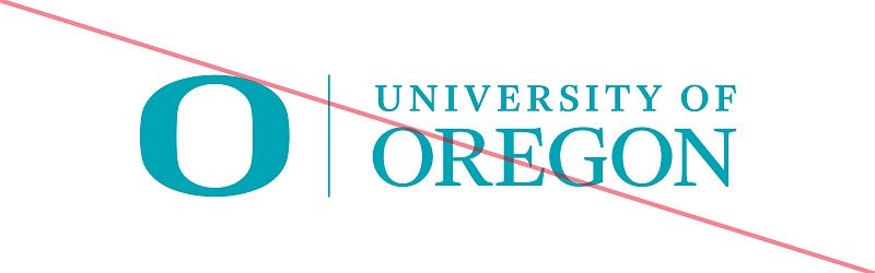
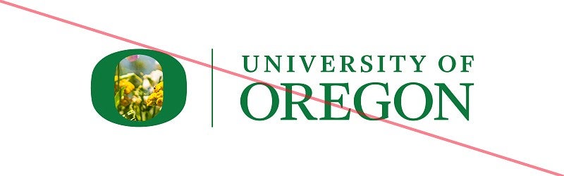
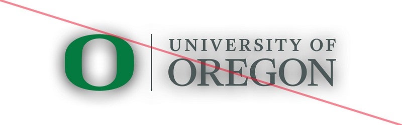
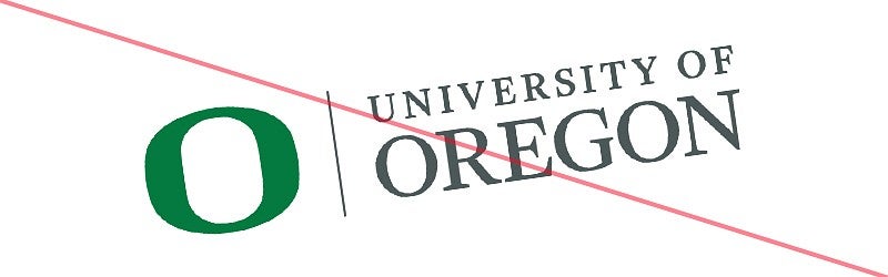
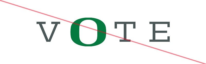
Do not treat the logo in any of the ways below, including the examples that follow:
- Do not attempt to recreate or redraw any part of the logo.
- Do not combine the “O” with other text.
- Do not add text, taglines, or graphic elements to the logo.
- Do not use the “O” as a decorative element.
- Do not resize the “O.”
- Do not use older versions of the logo unless referencing for historic purposes.



Logo Usage by Context
External-Facing Materials (Off Campus)
- The full primary logo is required on all materials viewed or distributed outside the University of Oregon.
- For materials such as brochures, booklets, or postcards, the “O” may be placed prominently on the front, always accompanied by the words “University of Oregon.” In this instance, the primary logo must be placed elsewhere on the piece, typically on the back cover, back of page, or back of postcard.
- Exception: Space-constrained formats (e.g., billboards, digital displays) may use the “O” alone.
- In these cases, the primary logo is not required.
- The words “University of Oregon” must appear elsewhere on the design.
- Do not place “University of Oregon” near the “O” to avoid creating a lock-up or alternate logo.
On-Campus Materials
More flexibility is allowed for campus-only applications such as banners, A-boards, digital displays, posters, and lawn signs.
- The primary logo is not required.
- The “O” and the words “University of Oregon” may be used in place of the primary logo.
- Do not place “University of Oregon” near the “O” to avoid creating an alternate logo.
Websites
The primary logo must always be present in the main navigation.
Using the “O”
The “O” can be used by itself in the contexts noted above.
The “O” may be cropped in print with written permission and review by contacting UO Marketing and Brand Strategy at uobrand@uoregon.edu.
If permitted, the “O” must always be accompanied by the words “University of Oregon,” the full complete “O” in the piece, or both. Clear space guidance still applies on un-cropped areas of the “O.” Cropping the “O” should be used to visually show momentum and for special and impactful projects only.
- The “O” may only be cropped at its halfway point vertically. Horizontal crops are not permitted.
- Only use the “O” on or in UO Green, UO Yellow, white, or black.
- When placing the “O” over UO Green, only use a UO Yellow “O.”
- When placing the “O” on UO Yellow, only use the UO Green “O.”
- Do not place images in the “O” or in the center of the “O.”
For internal licensed merchandise and apparel, using the “O” is prohibited; reference branded products and apparel for more information. Internal merchandise should include the UO’s primary or departmental logo.