Full Version
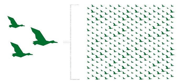
The full version of the soaring ducks pattern represents the forward-thinking and driven students, staff, and faculty across campus. Our ducks are going somewhere. Our ducks soar together. Use this pattern to create a sense of unity.
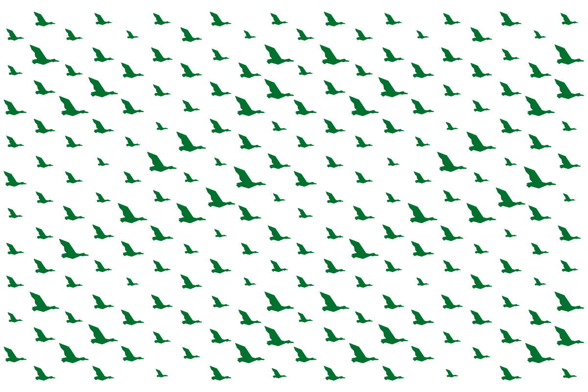
Variable Version
The variable version of the soaring ducks pattern represents that same same dynamic and forward-thinking campus community but allows for a clearer emphasis on the different paths our ducks take to get here. Use this pattern to create a sense of community.
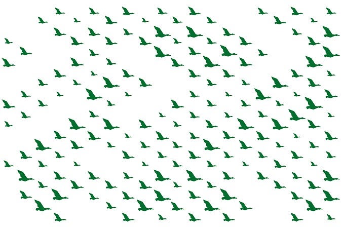
Breakaway Element
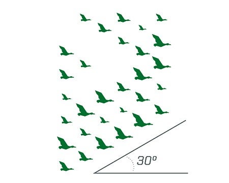
The soaring ducks breakaway element may be used as a supplemental design element. The breakaway element allows for a consistent use of the soaring ducks when they are pulled out of the pattern.
Limit the use of the breakaway to one application per layout.
The breakaway element follows the same guidelines as the soaring ducks pattern. Do not alter the arrangement of the ducks, apply a stroke to the ducks, adjust the scale or spacing of individual ducks, or combine the breakaway element with the swimming ducks pattern or wave element. To emphasize the idea of community, never use a single duck.
Best Practices
Color Combinations
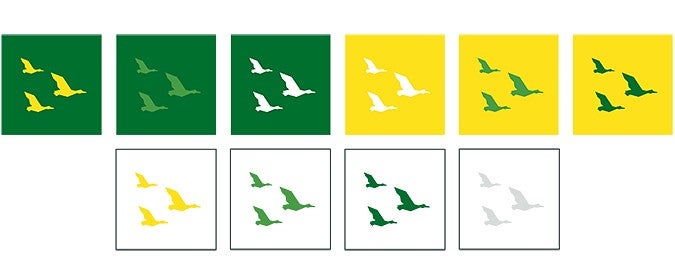
While the soaring ducks pattern and breakaway element may be used in most UO brand colors, use the color combinations below most frequently, with UO Yellow and UO Green being the dominant colors.
Never apply the ducks on or in dark blue, black, light blue, or berry.
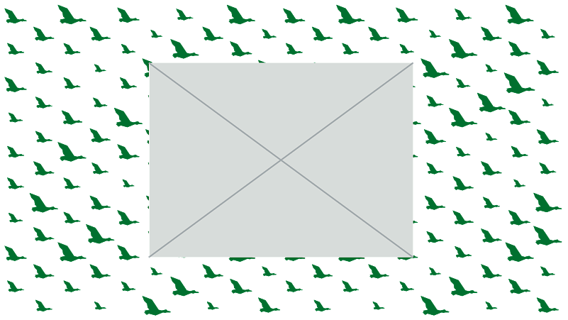
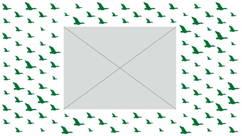
Masking
Cropping
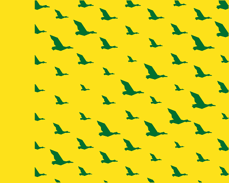
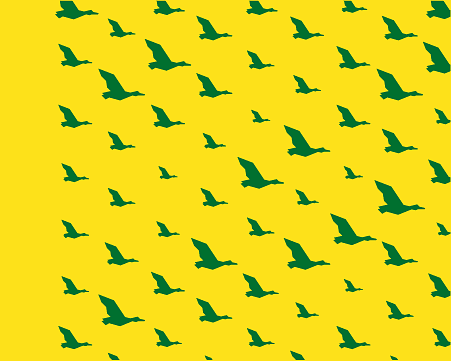
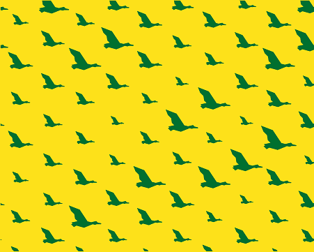
DO: Crop the pattern so there are at least seven ducks showing at a time to avoid confusion with the breakaway element.
Subtle Background Textures
Subtle background pattern textures are used primarily for the web, where the pattern may interact with text. When using subtle background pattern textures for print, work with your print vendor to ensure they resemble the examples shown. Only use the color combinations shown when creating textures with the patterns.
Stated opacity values are for screen applications only.

PATTERN COLOR: UO Green
EFFECTS: Multiply Effect, 10% Opacity

PATTERN COLOR: UO Yellow
EFFECTS: Screen Effect, 30% Opacity

PATTERN COLOR: Light Gray
EFFECTS: 25% Opacity
Subtle pattern textures are one of the few times we use opacities of color in our brand. Take care to use them as intended and refrain from using opacities or tints of UO brand colors elsewhere.
Opacity values may change depending on paper stock, vendor, or whether the application is for print or screen. When printing, use the given values as a starting point and work with your vendor to ensure the patterns are printing appropriately.
Gradient Background Textures
For a bolder approach, gradient textures leveraging UO brand colors can be used to seamlessly transition the pattern into the background. Only use the color combinations shown when creating textures with the patterns.

PATTERN COLOR: UO Green
EFFECTS: None

PATTERN COLOR: UO Green/Legacy Green Gradient
EFFECTS: None
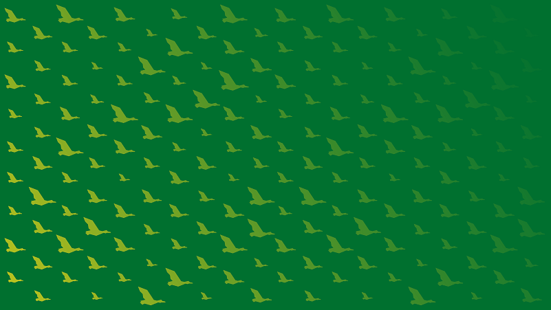
PATTERN COLOR: UO Gradient
EFFECTS: None
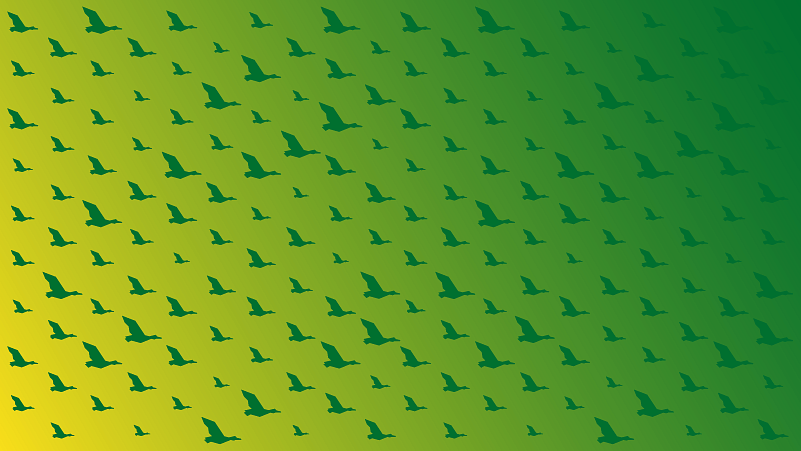
PATTERN COLOR: UO Green
EFFECTS: None
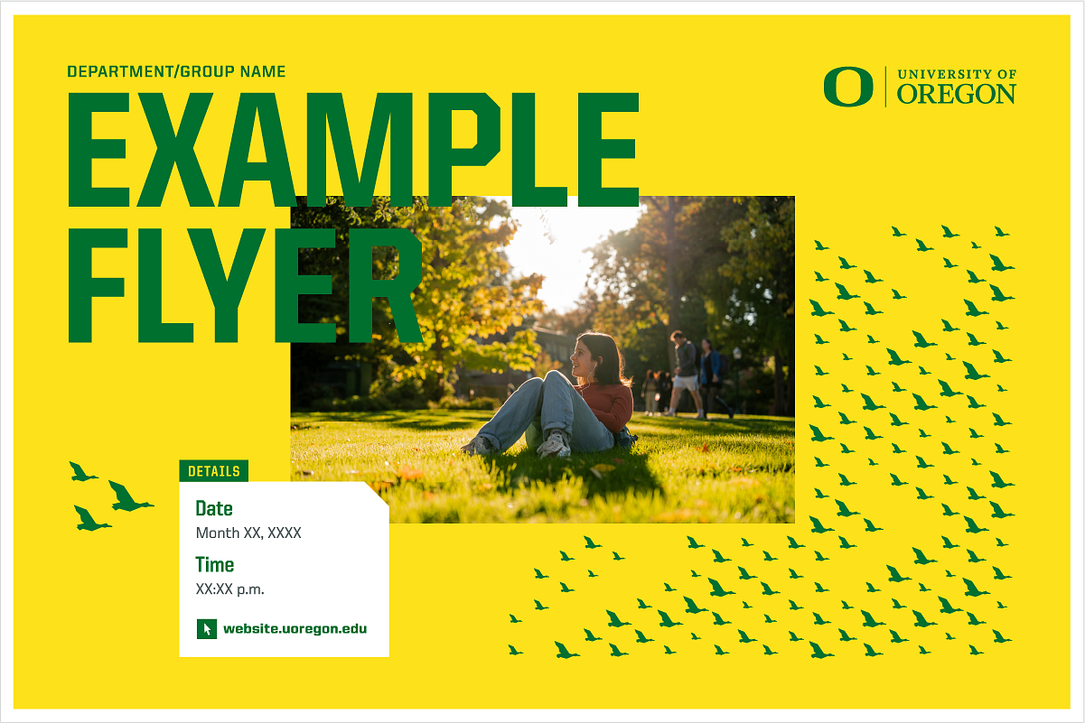
Soaring Ducks Pattern Use Example
Shown are examples of how the soaring ducks pattern can be used. Note how the ducks crop around photography and how the pattern transitions to the white space.

What to Avoid
- Do not add ducks to the breakaway element.
- Do not rotate or flip the patterns or breakaway element.
- Do not use a single duck on its own.
- Do not apply a stroke to the ducks.
- Do not use both the soaring ducks and swimming ducks patterns in the same layout.
- Do not combine duck patterns with any other pattern.
- Do not scale the ducks within the pattern or alter the pattern by removing or adding ducks.
- Do not change the colors of individual ducks within the patterns.
- Do not use colors outside of the UO brand color palette. Additionally, never apply the ducks on or in dark blue, black, light blue, or berry.
Merchandise Guidelines
- All duck pattern guidelines apply to merchandise.
- When placing the patterns on merchandise, always include the UO primary logo or a UO secondary logo to leverage the UO brand.
- Review the University Trademark and Licensing Policy when applying patterns on merchandise.
