Effects such as color overlays and monotone treatments add depth to a design when balanced with our authentic photography. This section includes guidance on creating color overlays and monotone images.
Color Overlays
For print, when placing color over images in Photoshop, first convert the image to grayscale. Then convert the image back to color and place a solid color over the image. Use the Overlay effect in Photoshop at 100% on the solid color. Create another solid color layer on top of the Overlay layer at an opacity of 60%. This layering of color helps ensure our brand colors stay accurate when placed over an image.
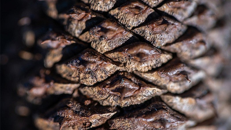
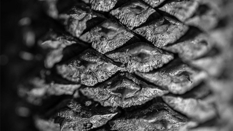
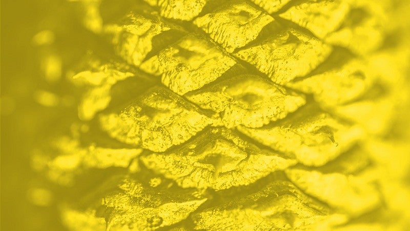
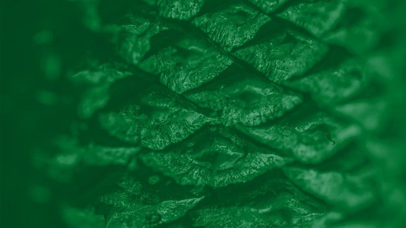
Color Overlays — Do’s and Don’ts
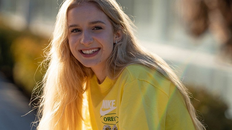
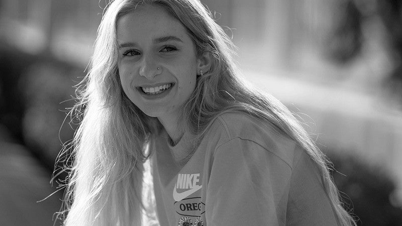
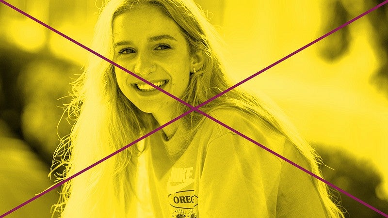
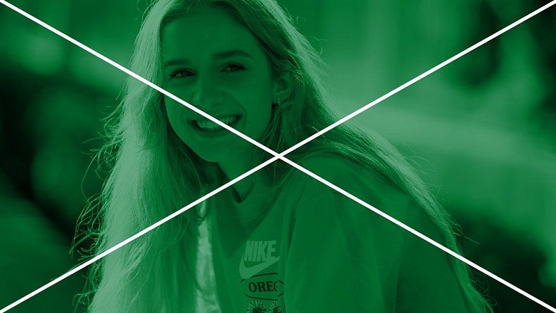
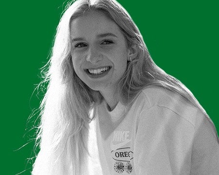
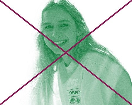
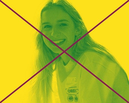
Do not place brand colors over images of people. Brand colors may be placed over buildings, nature, or textures. For images of people, use a grayscale or full-color photo treatment. The Duck may have UO brand colors applied.
Monotone Images
Monotone images always have the background color match the highlights to create a duotone effect. Grayscale images do not need to have highlights match the background.
To do this, do not create monotones using the duotone image settings in Photoshop, as this will automatically convert highlights to white. Create your monotone by selecting a Channel layer.
First, convert the image to Grayscale and adjust levels until you get the desired amount of contrast in the image. Convert back to your preferred color profile (CMYK or RGB). Select the main Channel labeled “RGB” or “CMYK” using Command + Click (Mac) or Control + Click (PC). Go into the “Select” menu and select “Inverse.” Apply a solid color using the current selection. Hide the original image layer. You may now place any UO Brand color beneath the new layer that was just created. See example grayscale and monotone treatments below.


Monotone Images — Do’s and Don’ts
Monotone images follow the same rules as color overlays in that color monotones cannot be used for images of people. For people, use grayscale images. Monotone images can use any of the UO brand colors, so long as UO Yellow and UO Green are the dominant color elements in the rest of the design.
Selective Color Overlay
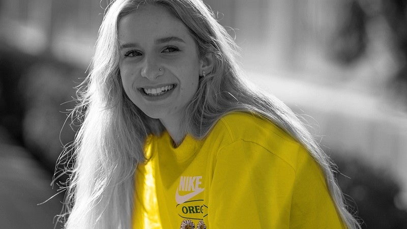
Additionally, small areas of UO colors can be added to grayscale images, as long the colors are minimal and not applied over faces. Additionally, ensure these areas of color do not obscure or change the intended color of branded merchandise or logos.
Texture
Monotone and color overlay images have a subtle Photoshop Noise effect applied. Noise settings are: Gaussian treatment, Monochromatic. Noise amount is variable depending on the size of the image.
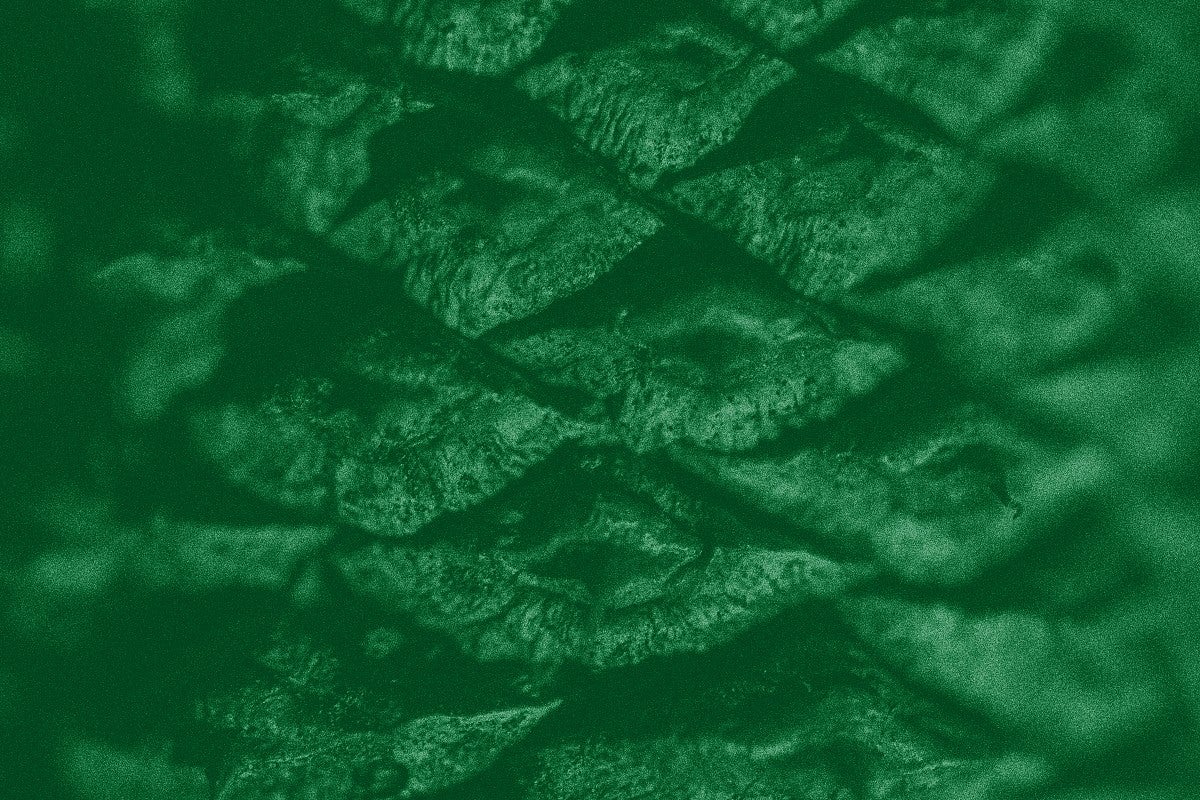
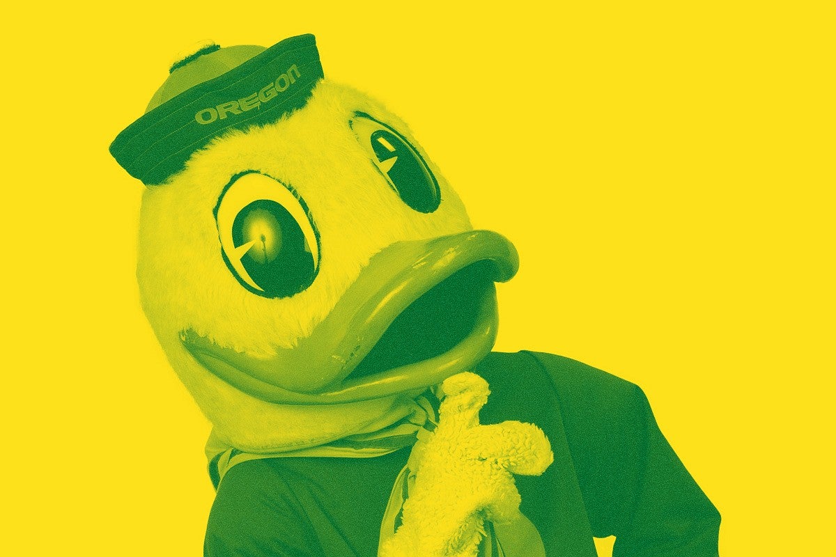
As images scale, keep this in mind: The Noise effect is intended to be a subtle textural element and may need to be adjusted as images scale. Always apply the Noise effect when the image is at 100% size.

