The University of Oregon primary logo is the cornerstone of our identity system. It is the most immediately recognizable signifier of the Oregon brand and should be used to represent the university in all communications. The university maintains a policy for the purpose of establishing guidelines and regulations for the use of the University Seal, the Oregon Duck, and the logo, and other related brand and trademarked information. Please review the policy prior to the use of these marks. One-time exceptions can be granted in writing on a case-by-case basis in consideration of University Communications goals. The UO Marketing and Brand Strategy team aims to maintain consistent enforcement with professional use of our trademarks to promote and protect the university image and reputation.
Primary Logo: Horizontal
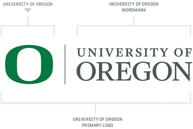
The primary logo consists of three elements: the Oregon O, the rule, and the university wordmark. Changing the primary logo or making variations is prohibited. The primary logo should be used in horizontal orientation when possible.

Primary Logo: Vertical
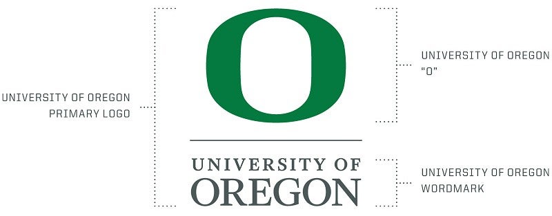
In cases where the horizontal logo doesn’t fit with design or space considerations, the stacked logo is permissible. As with the horizontal logo, there are requirements for color, size, and clear space.

Clear Space and Minimum Size
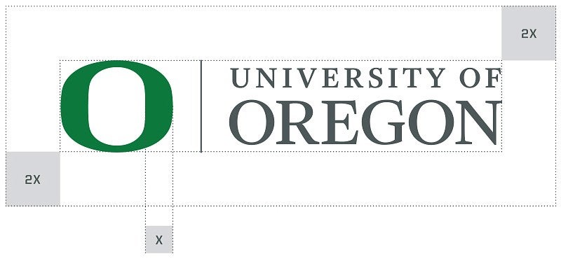
Maintain size and space standards when using the UO logo to ensure our most important identifier is prominent, legible, and impactful. The space around the logo is based on the width of the thickest part of the O. Minimum clear space should be 2x this width on all sides.

In print, the O should be no less than 3/8" (.375") high in horizontal or stacked versions. Logos should be sized proportionally to meet this standard.
There is no maximum size limit, but use discretion when enlarging the logo (e.g., the O with the wordmark). It should never dominate the page but should be clear and distinctive as our identifying mark.
As a stand-alone, the O can be used as a dominant element.
Note: Exceptions to the minimum size rule may apply for extremely small applications such as pens or small-space ads. Contact uobrand@uoregon.edu
Logo Color
The primary color for the primary logo is UO Green and UO Dark Gray. It is to be used on white or lighter-color backgrounds. Do not use the logo over backgrounds that do not provide sufficient contrast.
Other permissible colors are shown below. The logo can be used in only these color combinations. Color backgrounds below are for illustration purposes only. The logo should not be placed inside any box.
Note: Logos rendered entirely in medium gray (PMS 429) are considered outdated. While some logo packages in the Brand Library may still include these versions, they should not be used.


Incorrect Usage
Do not treat the logo in any of the ways below, including the examples that follow:
- Do not attempt to recreate or redraw any part of the logo.
- Do not combine the O with other text.
- Do not add text, taglines, or graphic elements to the logo.
- Do not use the O as a decorative element.
- Do not resize the O.


