Our words carry weight, and so does our typography. When used thoughtfully, typography can add visual meaning to the words you choose.
We use one typeface—United—for nearly all of our materials. Its breadth of styles gives us the flexibility to tailor the typographic style of each piece to its audience while building brand recognition.
Fonts are licensed and the university has a limited number of licenses for the font packages below. Licenses are reserved for employees whose position descriptions delegate them as primary communication employees who produce design work. Individuals with the license should not share the files or use for personal use. For more information or to purchase a license, contact uobrand@uoregon.edu.
Primary Typefaces for Print
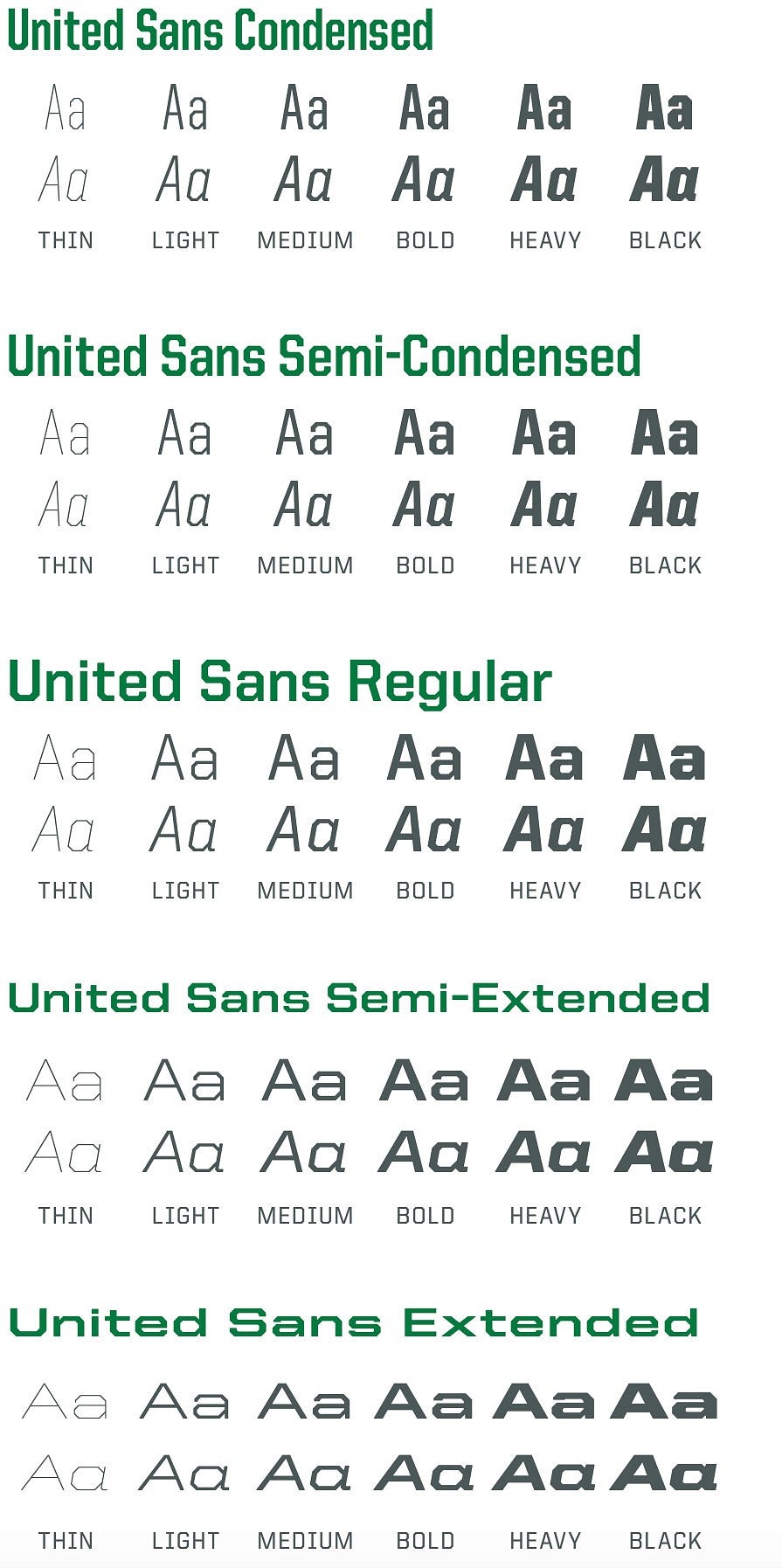
Our primary typeface, United, comes in several styles. We use it for everything from headlines to body copy.
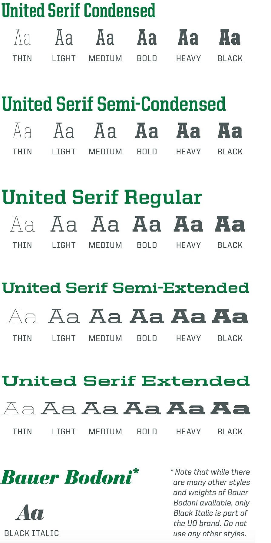
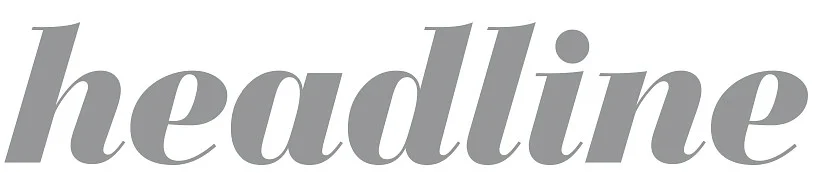
Our accent typeface—Bauer Bodoni Black Italic—is available for select headlines. It works well when used as a headline but should not be used for body copy.
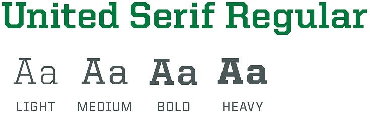
Because the variants of United Serif do not include italics, they should be reserved for headline treatments rather than large blocks of text.
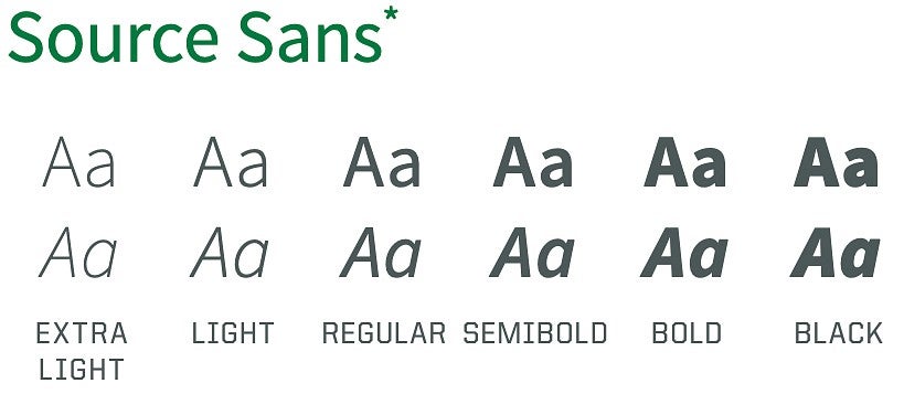
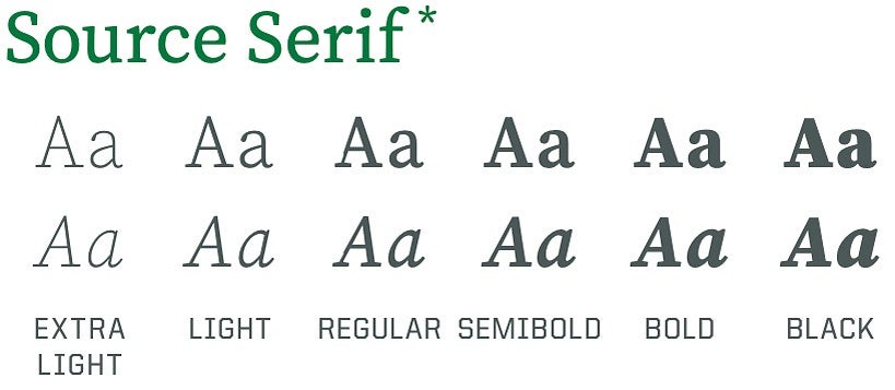
Source Sans and Source Serif are utility fonts to be used primarily for business correspondence when United is not available.
Note: The United family includes a style—Stencil—that is not part of the UO brand and should not be used. The university is unable to provide typeface files and font licensing requirements prevent sharing of files.
Note: There are many styles and weights of Bauer Bodoni but only Black Italic is part of the UO brand. Do not use other styles.
Web and Secondary Typefaces
University of Oregon websites share a consistent look and feel—we want our audience to know at a glance that they’re visiting a UO website.
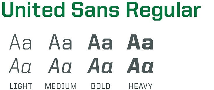
Our web typography includes three key typefaces: United Sans Regular, United Serif Regular for headlines, and Source Sans Variable for body text. If you are unable to license United, use Source Sans as a replacement font.
Use United Sans Regular and United Serif Regular for headings, subheads, and header and footer text. Use Source Sans for body copy and instances in which United is unavailable. Source Sans and Source Serif are alternative fonts in digital and print when United is unavailable.
Note: The University of Oregon has licensed United for all uoregon.edu domains. Contact uobrand@uoregon.edu for more information about using United on your website.
Note: Source Serif is used for business correspondence. Source Sans is also available for business correspondence and can be used for digital and print applications.
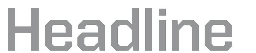
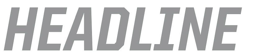
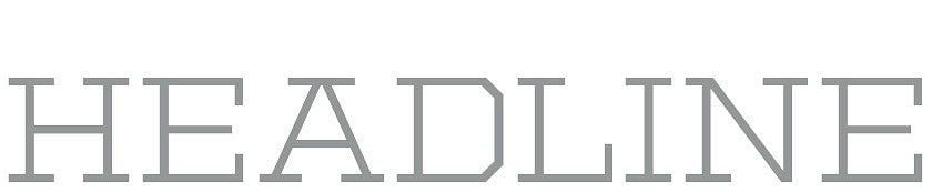
Headlines
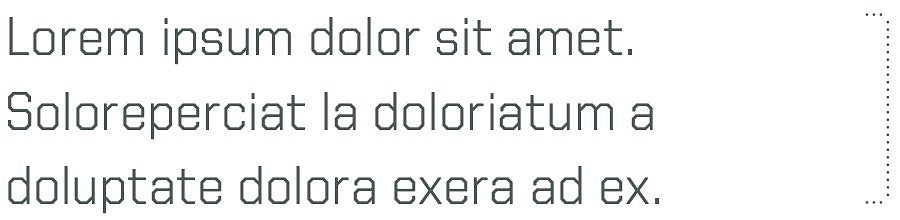
KERNING: OPTICAL | TRACKING: 0
KERNING: OPTICAL | TRACKING: -10
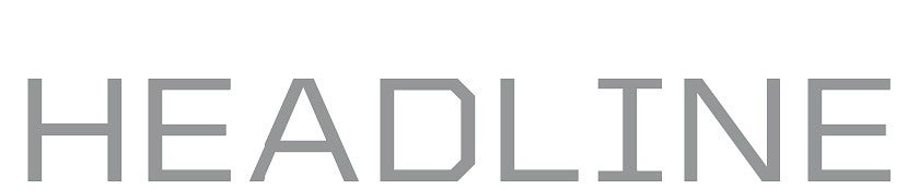
KERNING: OPTICAL | TRACKING: 0
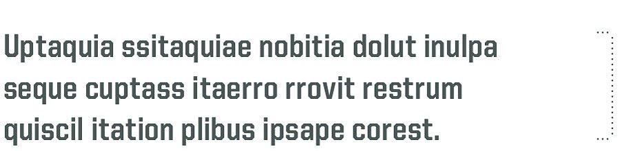
KERNING: METRICS | TRACKING: 0
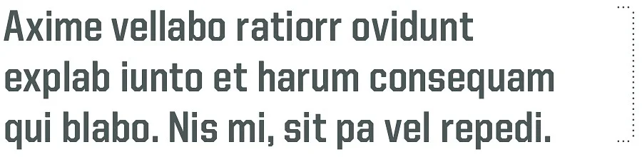
KERNING: OPTICAL | TRACKING: -25
KERNING: OPTICAL | TRACKING: 0

KERNING: OPTICAL | TRACKING: -20

KERNING: OPTICAL | TRACKING: -20
*The examples of text above have been altered for the web and may not represent the text size listed.
**Secondary font, use primarily for business correspondence.
Strategic typography can take a great headline to the next level. When you hit upon just the right synergy between typestyle and tone, your headline can make a bold statement.
The styles shown above are suggestions, not mandates. Just remember that headlines set in United look best in all caps, while Bauer Bodoni should never be set in all caps.
Note: The headline styles above are not applicable on University of Oregon websites. For information on web typography, visit our digital strategy website.
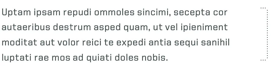
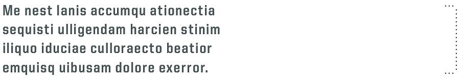
Text Styles
KERNING: OPTICAL | TRACKING: 0
KERNING: OPTICAL | TRACKING: -5
KERNING: OPTICAL | TRACKING: 0
KERNING: OPTICAL | TRACKING: 0
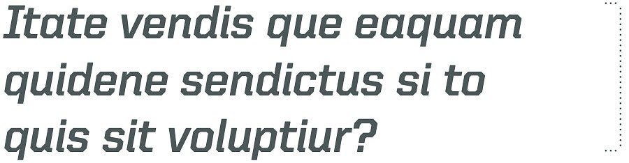
KERNING: OPTICAL | TRACKING: -5
KERNING: OPTICAL | TRACKING: 50
*The examples of text above have been altered for the web and may not represent the text size listed.
When used thoughtfully, typography can be a powerful brand tool that strengthens and supports our message.
When designing with type, consult the suggested styles and note the following:
- Subheadings in United often look best in all caps.
- Avoid United’s thinner weights when using small text.
- Limit Bauer Bodoni and United Serif to headlines. For all other text, use United Sans.
- Vary type sizes and weights to create a text hierarchy, which guides the reader by visually emphasizing important information.
- Avoid setting text in sizes smaller than 7.5 pt.
Note: The text styles above are not applicable on University of Oregon websites. Visit our digital strategy website for information on web typography.