Visual Identity
The University of Oregon has a collection of visual assets we use to consistently express our brand. These assets have a look and feel that complement and communicate our values and brand attributes. We encourage you to explore these tools and consider how unique combinations can connect with your communication goals and audience.

Fonts
Typography is a great way to convey a visual tone with your audience. Consider how the typeface, weight, and contrast of the fonts can add visual interest and enhance a design. Explore our font collections and their recommended uses.

Colors
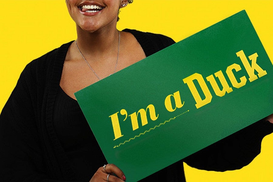
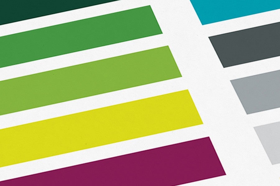
There is no denying the iconic combination of our UO green and yellow. These colors connect our audience to the university and build brand recognition with our audiences. We use these colors dominantly in our work to build trust with our audience and connect with our brand.

Photo Color Treatments
Effects such as color overlays and monotone images add depth to a design when balanced with our authentic photography. Learn how to apply these engaging photo effects while maintaining our brand identity.
Graphical Elements
We have a number of ways we can express our brand through design. We have a unique set of graphical elements to combine and heighten the design and enforce our brand. Explore the many options and ways these can enhance your work. Not seeing something you would like to use? Propose an idea to our Marketing and Brand Strategy team.
Web Design Standards and User Experience
Our Digital Strategy team works to provide a set of resources and standards that support accessibility, communicate the brand, and provide our audiences with consistent and meaningful experiences. The university has required web design elements. Explore the design standards and other resources or email our team for support at webservices@uoregon.edu.
