
We’re a bold, dynamic brand that likes to make a visual splash. That’s why we’ve developed graphic tools that can enhance our storytelling by connecting words with visuals. When used consistently, they create visual impact and continuity across a variety of media and materials. But these aren’t just decorations. Use them purposefully, in a way that’s firmly rooted in our brand positioning, to help amplify tones.
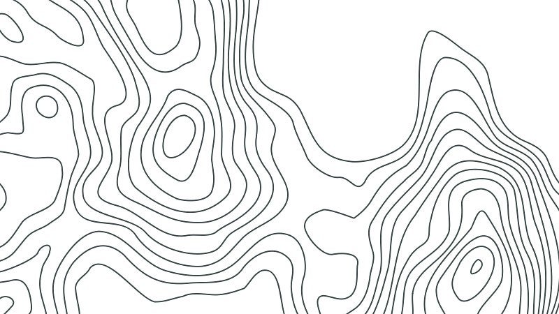
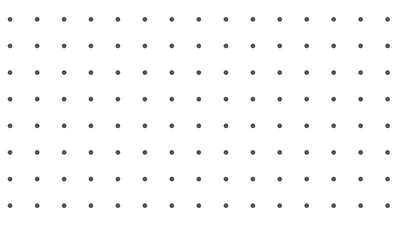
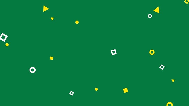
Patterns
Inspired by the natural world, our brand patterns add depth and dimension to designs.

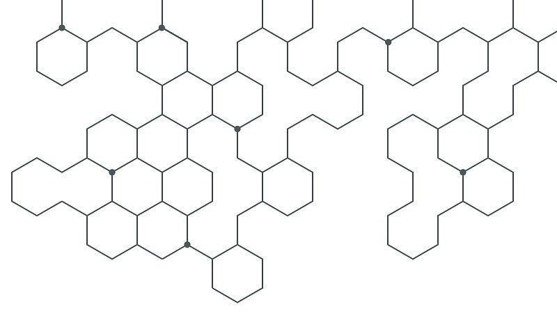
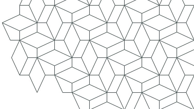
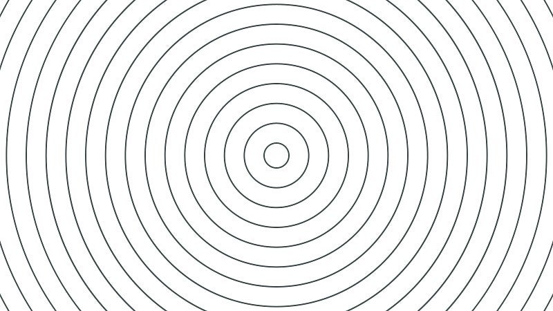
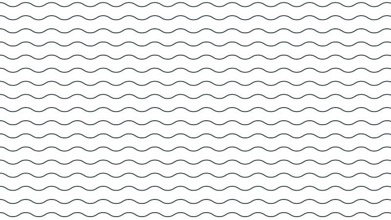
Follow these guidelines for patterns:
- Use only one at a time. Never overlap patterns.
- Keep line weights consistent. For most print pieces lines should be 0.75 pt. For larger artwork such as banners, scale the line weight proportionally from the original artwork size. For screens, use 2 pt.
- All patterns except Confetti are one color. Any brand color is appropriate.
- Take care when cropping patterns. Let the natural edges show when possible (as shown in Prism, Molecules, and Topo Lines).
- Patterns work best when used intentionally rather than decoratively.
- Clear space rules apply when a pattern is placed near the UO Signature.
- Do not create patterns. Patterns are created and maintained by UO Marketing and Brand Strategy.
- Visit the Digital Strategy website for use of patterns and backgrounds on UO websites.
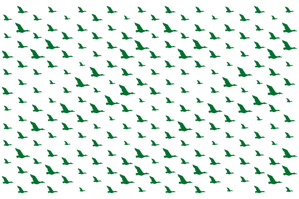
Athletics Flying V Duck Pattern
The Flying V pattern is an athletic mark made available to campus partners on a case-by-case basis. The pattern may not be utilized without permission from UO Marketing and Brand Strategy. To obtain permission to use the Flying V pattern, please send an email to uobrand@uoregon.edu with details on your intended use.
Please note: most merchandise and apparel requests will not be approved. Apparel that is approved must be on a Nike product.
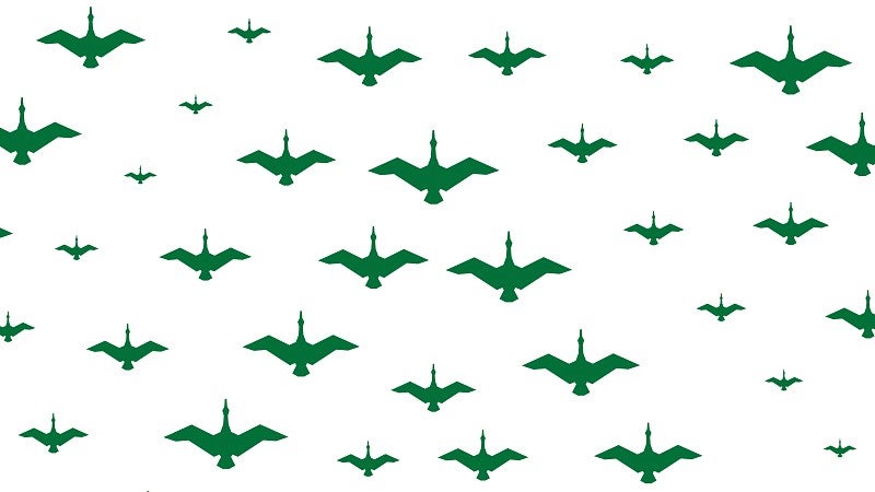
If the Flying V pattern is approved for a one-time use, follow these guidelines for the Flying V pattern:
- Pattern should have the ducks flying up or at a 90 or 45 degree angle. The Flying V pattern should never be used with the ducks flying down.
- Do not apply a stroke to the pattern or individual ducks.
- A single duck or a section of the pattern can be used, but do not alter individual ducks or change the arrangement of the pattern.
- Do not utilize the Flying V pattern over other graphical elements.
- The Flying V pattern may only be used in UO primary green and yellow colors, gray, black, white or as a spot gloss on print. Do not apply multiple colors or gradients to the pattern.
- Do not repeat use on a reorder or reprint without approval each time.
Non-Athletics Duck Patterns
While the Flying V pattern is limited to athletics, the University of Oregon offers two alternative patterns that embrace our identity as ducks.

Icons
Icons are simple visual symbols that draw attention to information. The UO has a set of more than one hundred icons designed to simply and effectively represent elements and ideas.
Follow these guidelines:
- Icons should be used at small to medium sizes.
- Icons can appear in any color from our palette, but all elements within the icon must be the same color.
- Keep the line weight consistent: 0.75 pt in print and 2 pt on screen.
- All icons use flat end caps, miter corners (with a threshold of 5), and leverage a 45-degree angle.
- Avoid rounded corners and use them only when necessary.
- To scale an icon for a large application such as a billboard or banner, scale the stroke proportionally. Ensure the same stroke weight is applied to all icons if multiple icons are used.
- Do not create icons. Contact uobrand@uoregon.edu for custom icons. If a specific use case for an icon is needed, an icon can be created using the icon template in Canto. The icon must be approved by University Communications before it can be used.
Note: Icons are meant to support content. They should never be combined with college, department, or program names to form a logo.
Line Illustrations
When creating illustrations, we follow rules similar to those used for icons but can develop more detailed images that are better for viewing at large sizes and better represent an idea or story. We can add dynamic perspective and detail. As a top-tier public research university, our illustrations must be accurate and true to the subject.
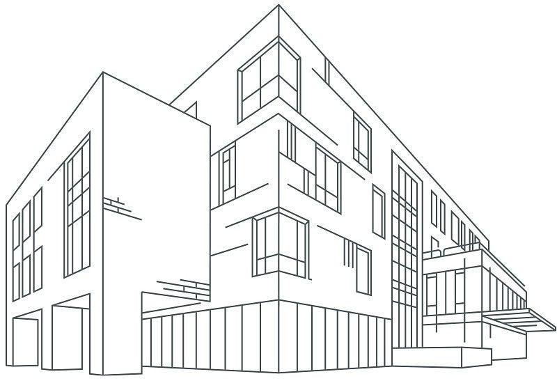
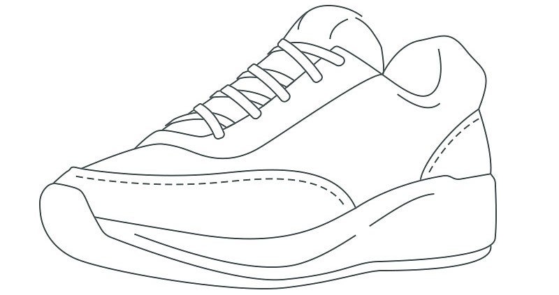
Follow these guidelines:
- Illustrations should be used at medium to large sizes.
- Illustrations can appear in any color from our palette, but all elements within the illustration must be the same color.
- Keep the line weight consistent: 0.75 pt in print and 2 pt on screen.
- Use the same stroke settings as the icons: Flat end caps, miter corners (with a threshold of 5).
- When using multiple line art illustrations in a print or digital composition, all artwork must have the same stroke weight.
- When printing illustrations at large sizes for banners, tote bags, etc., use the icons as your guide. Take an existing icon, scale it proportionally to the size you want, and use the proportionally scaled stroke weight in the icon for all elements in your large-scale illustration.
Note: Illustrations support content. Do not combine them with college, department, or program names to form a logo.
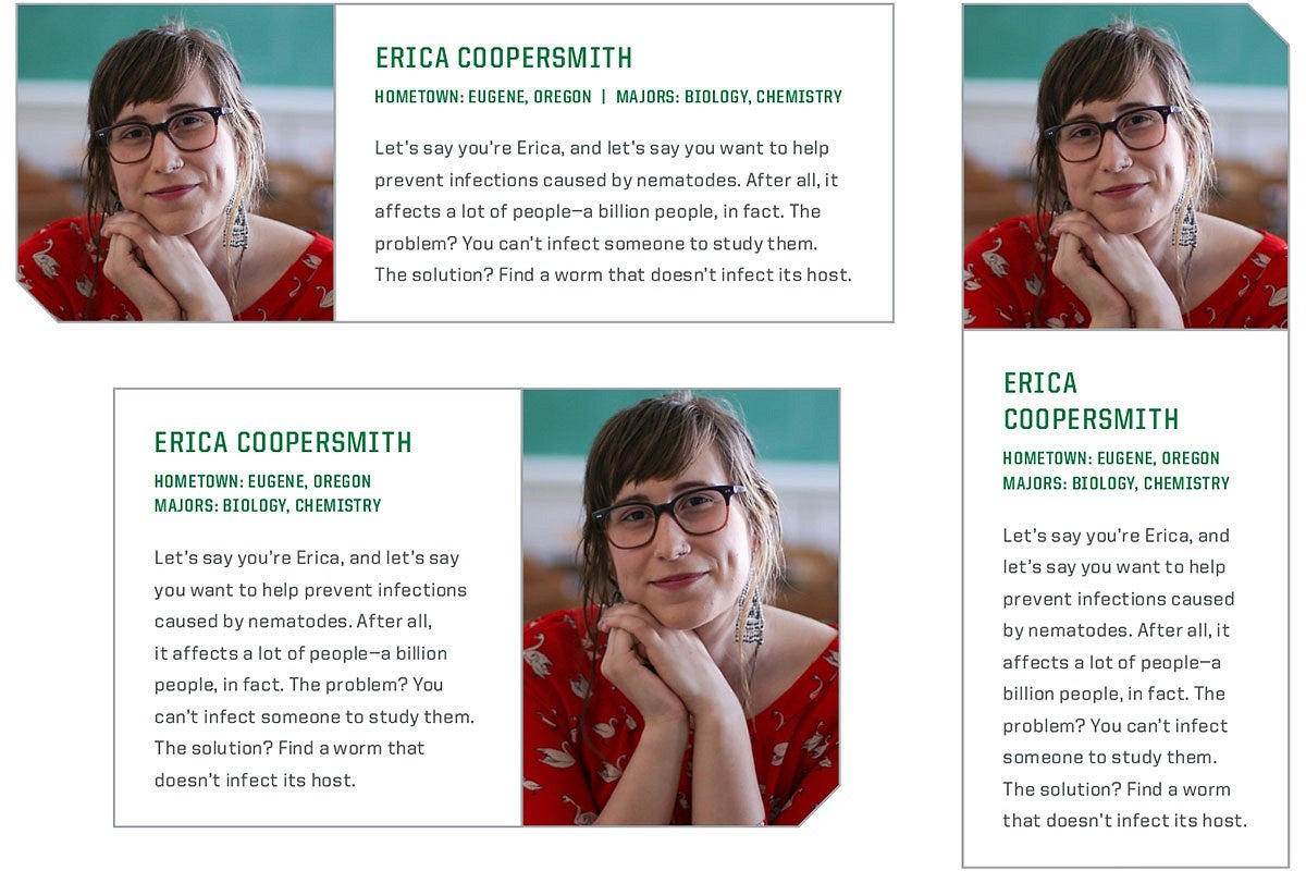
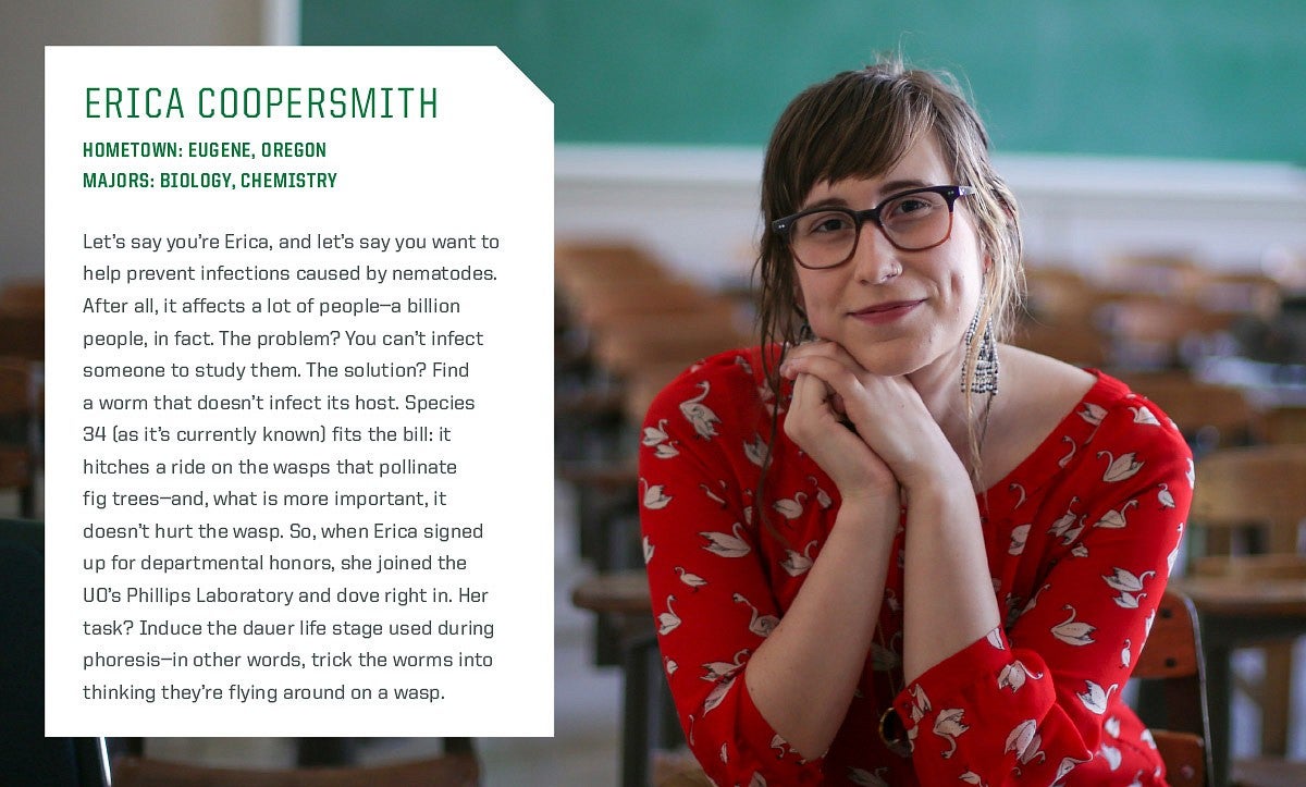
Containers
Our signature container is a box with a beveled corner. Use it to contain text or photos. Details such as the bevel, which mirrors the angled cuts in the United typeface, create continuity across our materials.

Follow these guidelines:
- Only one corner of the box can be beveled, but you can choose which corner. Bevels must be at a 45-degree angle.
- Use the beveled corner sparingly and thoughtfully. Limit to one box per page.
- When placing text within a beveled-corner box, use generous inside margins.
- Do not apply these styles on UO websites. Visit the Digital Strategy website for web template styles.
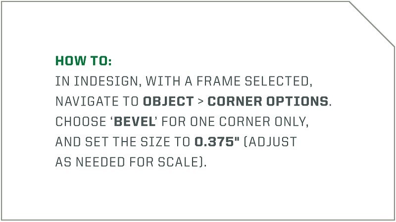
How To
In InDesign, with a frame selected, navigate to Object > Corner Options. Choose “Bevel” for one corner and set the size to 0.375" (adjust as needed for scale).
Note: Standard design software such as the Adobe Creative Suite includes tools to create the bevel. If you are designing in a program that does not offer this feature, do not use beveled-corner boxes.
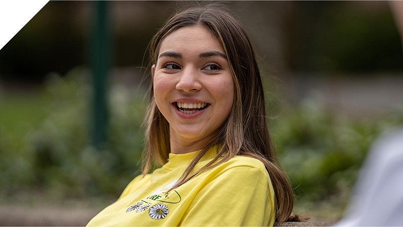
Profiles
People are the heart of our university and celebrating them is fundamental to our brand.
Remember these guidelines:
- Portraits should follow UO photography style. Subjects should be looking at the camera and alone in the frame. Environmental portraits are recommended.
- Size the photo so the face is centered within the frame, with the top of the head and neck visible.
- Generally, only one profile should be visible at a time. To highlight multiple people, consider a layout other than the ones shown.
- Do not apply these styles on UO websites. Visit the Digital Strategy website for web template styles.
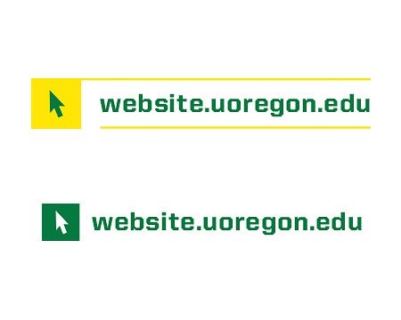
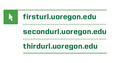
URLs
A consistent style for URLs helps our audiences recognize a call to action and find more information online.
Small URL Styles—Single URL


Small URL Styles—Multiple URLs


Large URL Styles
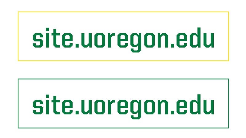

Remember these guidelines:
- URLs set in these styles should link to websites within the uoregon.edu domain.
- Colors used in URL styles must be chosen from our brand palette.
- When using the two-color small URL style, the outlined box can be a different UO primary color than the URL text.
- Do not combine icons other than the cursor icon with URLs.
- Do not bevel a corner of the box around the large URL.
- Do not apply these styles on UO websites. Visit the Digital Strategy website for web template styles.
Statistics
Highlighting statistics, rankings, and other numbers in a bold style communicates our value without bragging.
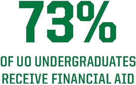
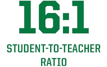
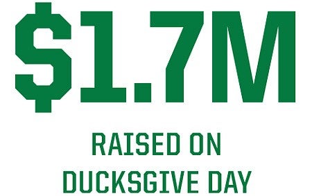
- For the large number or text, use United Sans Semi-Condensed Heavy, Optical Kerning, Tracking 0, 0.0693” spacing after.
- For the caption, use United Sans Semi-Condensed Bold, Optical Kerning, Tracking 20. Leading is generally 2 pts larger than caption size.
- Visit the Digital Strategy website for instructions on using "big numbers" on UO websites.
Note: Please work with a UO communications professional if you do not have access to the licensed font or contact uobrand@uoregon.edu with questions.
Please review the information on this page (above) before downloading icons and patterns from the UO Brand Library or requesting a custom icon.