

Color is one of the most powerful and recognizable ways we express our brand identity. Rooted in nature and drawn from our environment, our colors help tell the story of who we are. Color can enhance our voice, reflect our tone, and help our audience make instant connections.
When using color on the web, follow color contrast requirements for accessibility. Use the UO Color Contrast Chart to check your color combinations.
Do not use tints or opacities of the colors in the University of Oregon color palette. Tints or opacities of white or black may be used to increase legibility of type over image, such as subtle gradients over photos or subtle drop shadows behind type.
* NOTE: UO design assets are housed in the Expanded UO Brand Library, which is restricted to UO marketing and communications professionals. For inquiries about access to these assets connect with us at uobrand@uoregon.edu.
Primary Brand Colors
Always use UO Green and UO Yellow in all visual compositions. These are our primary brand colors. Refer to color ratios further on this page to see how our primary colors balance with our secondary palette.
Note: For color builds, use the color values listed here. They’ve been adjusted for the best reproduction in print and on screen and do not match Pantone® Color Bridge breakdowns. To serve people with impaired vision, some of our web color values have been altered slightly from print color values. Always use the hex color values listed here to ensure they meet accessibility standards. If you are using the Cosmic theme, use our web color classes as they include web formatting styles to meet text accessibility standards.
HEX: #007030 | PANTONE: PMS 356
HEX: #FEE11A | PANTONE: PMS 107
UO Print Services Color Adjustments
When sending files to UO Print Services, use the following color builds for UO Green and UO Yellow. These color builds have been created with input from UO Print Services to ensure accurate color reproduction with their equipment. To ensure the best representation on a variety of paper stocks, there are two CMYK color builds for both UO Green and UO Yellow.
- For coated stocks, use 90-10-100-20 (UO Green 356c).
- For uncoated stocks, use 90-0-100-18 (UO Green 356u).
- For coated stocks, use 0-13-72-0 (UO Yellow 107c).
- For uncoated stocks, use 0-11-78-0 (UO Yellow 107u).
Secondary Brand Colors
While our secondary color palette takes a lesser visual role compared to UO Green and UO Yellow, it adds depth to our brand. To create a balance between our secondary and primary colors, ensure that UO Green and UO Yellow are always present when using secondary colors.
When adding secondary colors, do not create designs that don’t reflect the University of Oregon brand—or worse, that appear to represent another institution.
Tints and shades of the colors are prohibited. Below are the color builds for our secondary palette. If your project calls for secondary color Pantones, please contact uobrand@uoregon.edu.
HEX: #000000
HEX: #3D4546
HEX: #A2AAAD
HEX: #E6E6E6
HEX: #004D30
HEX: #489D46
HEX: #8ABB40
HEX: #E8F1D9
HEX: #1B3B58
HEX: #53C0D8
HEX: #E1F1F6
HEX: #F5A604
HEX: #FFF7C6
HEX: #F8F2E8
Color Gradients
Our brand includes seven linear gradients. Do not use gradients other than these seven. To leverage a sense of forward movement, use the gradients with the shift in color moving from left to right. To create a sense of depth, gradients may be used from bottom to top.
Do not use radial or angled gradients and limit the use of gradients to one or two per page to show intentionality. Gradients are available in the expanded brand library.







Examples of Gradients in Artwork


Using Color
Using color appropriately is one of the easiest ways to ensure your communications reflect a cohesive UO brand.
Use UO Green and UO Yellow in all materials. Our primary colors must always be present to visually relate to the University of Oregon. Secondary colors are intended to support our primary colors.
Also, keep the following in mind when using color:
- Use Obsidian primarily for body text.
- On the web, provide sufficient color contrast for text and graphics.
- Exercise caution when using Duck Bill, to differentiate from neighboring institutions. Do not use large areas of Obsidian (black) and Duck Bill together.
Use the color ratio chart and examples below as reference for the visual balance between our primary colors and our secondary colors in all materials.

Examples of Secondary Color Use
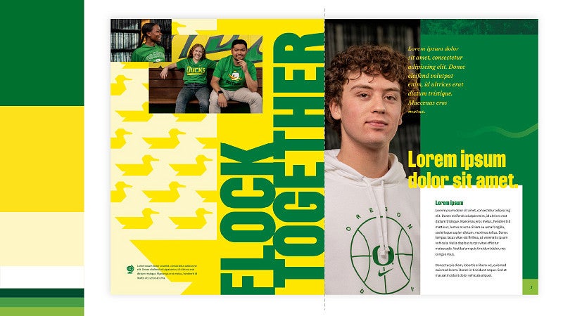
Some layouts may lean heavily on UO Yellow and UO Green. The use of analogous secondary colors and white space add to the visual depth of our primary colors.
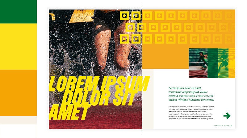
Use white space to further balance primary and secondary colors. This ratio application works well in multi-page documents, where UO Yellow and UO Green can hold more visual weight in other areas of the document.

Balance large applications of secondary colors with bold applications of UO Yellow and UO Green. In this ratio, note that UO Yellow and UO Green, combined, hold more visual weight than the secondary colors.
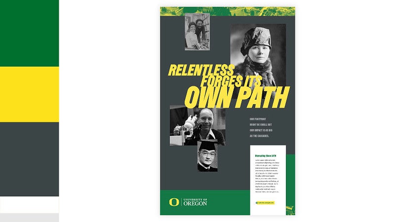
Secondary colors can emphasize colors present in photography. Use bold applications of UO Yellow and UO Green to give our primary colors visual dominance. In this ratio, note that UO Yellow and UO Green, combined, hold more visual weight than the secondary colors.
Color Exceptions
There are times when other colors promote a connection to cultural celebrations, identity groups, or significant awareness campaigns. These efforts promote our institutional value of inclusion and other colors are permitted for these efforts (e.g. heritage months, sexual assault awareness month, identity based groups, etc.). Ensure the university logo is connected to the communication campaign and work to align our UO brand as appropriate to enhance an inclusive campus culture. As a public university, we do not align our brand to religious or political organizations though acknowledge those are identities one may hold. The university protected marks may not be connected with celebrations or organizations that do not promote the mission of the institution. If you have questions about the exception, you may contact uobrand@uoregon.edu.
Commencement
Historically used as the primary color for our institution, Evergreen (sometimes referred to as Legacy Green) is deeply embedded in the tradition of our commencement ceremonies. Because of this, the darker Evergreen color can be used as the primary color in place of UO Green (PMS 356) on commencement-specific materials such as regalia, banners, pennants, cords, degree frames, commencement programs, and announcements.
Evergreen will not be approved for the use of apparel or merchandise that are not commencement-specific materials or regalia. In those cases, UO Green remains the primary green.
Metallic Colors
Contact uobrand@uoregon.edu when considering the use of metallic colors for your project.
The application of metallic colors through the treatment of foil embossing or metallic inks should be used sparingly. Overuse of this technique can dilute its strength to convey a sense of importance, elegance, exclusivity, and value. Metallic colors should be reserved for materials such as special event invitations and associated collateral, certificates and awards, and exclusive or high-impact marketing projects. Colors are limited to chrome, UO green (PMS 356), and UO yellow (PMS 107) foil.
Do not use metallic colors for:
- Departmental stationery such as letterheads, envelopes, and business cards.
- Non-exclusive merchandise, swag, or giveaways.
- General handouts and printed materials.
- Merchandise or print materials that are not of high quality.
- The mascot mark.
- Creating new color treatments of the primary or secondary logos other than those listed on the brand site.